- eCom Email Marketer
- Posts
- Blueland’s Black Friday Email: Sustainability Meets Savings
Blueland’s Black Friday Email: Sustainability Meets Savings
Chase Dimond & Jimmy Kim
October 27, 2025
Your retention spell book is here 🔮 Become a certified email & SMS marketer for $350 off w/ code: HOCUSPOCUS

Hey it’s Chase and Jimmy here!
Black Friday doesn’t have to mean chaos and overconsumption.
Blueland’s “Green is the New Black” campaign proves you can run a high-performing sale without compromising your values. With clean design, real customer proof, and a calm-but-confident tone, it’s a refreshing take on the noisiest shopping weekend of the year.
Here’s how they pulled it off.
Also inside:
✔️ Send Smarter: Your Guide to BFCM SMS Success
✔️ Stop Letting Broken Tracking Kill Your Klaviyo Flows
✔️ Industry Intel: UI Shifts, Beauty Trends, and Discovery Behaviors on Social
✔️ Hiring Vault: 7 New Retention Marketing Job Ops
Let’s break it down 👇
📱 Send Smarter: Your Guide to BFCM SMS Success
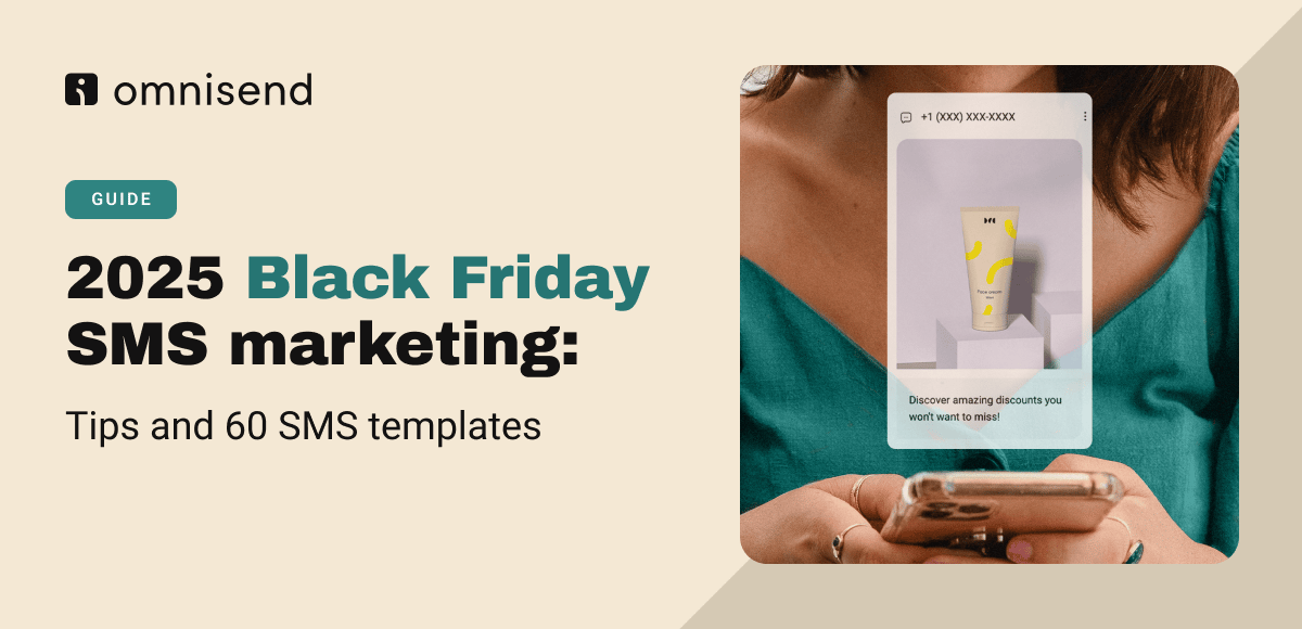
Mobile drove 57% of Black Friday sales last year (worth $7.6 billion).
But here’s the problem: most brands still treat SMS like a megaphone.
They blast the same message to everyone at once… and wonder why opt-outs spike faster than sales.
This year, do it smarter. Omnisend’s Black Friday SMS Marketing Guide shows you how to turn texts into real revenue with:
60+ ready-to-send templates for every campaign type
Proven send times to hit customers when they’re actually shopping
Real brand examples that balance urgency with trust
Tips for combining email + SMS to double conversions
Your customers are shopping on their phones.
Make sure your messages show up (and sell).
Blueland’s Black Friday Email: Sustainability Meets Savings
Blueland flips the traditional Black Friday narrative on its head… turning “Green is the New Black” into a statement about clean, conscious savings. The result is a campaign that feels polished, purposeful, and refreshingly on-brand.
Let’s dive in.
Header Block
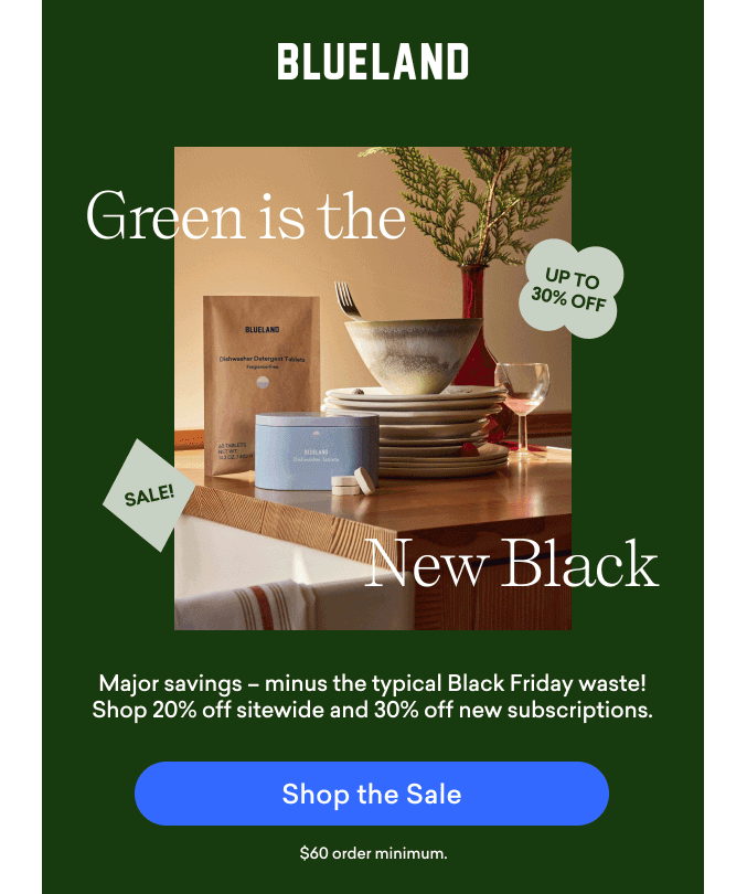
What We Love
✔ Strong thematic hook. “Green is the New Black” instantly reframes Black Friday in Blueland’s eco-conscious voice.
✔ Clear offer presentation. “20% off sitewide and 30% off new subscriptions” makes it easy to understand the value right away.
✔ On-brand visual pairing. The dark green background and neutral product photography reinforce the brand’s sustainable positioning.
What We’d Do Differently
❌ The “Up to 30% Off” badge could be larger or repositioned for better visibility against the muted tones.
❌ The CTA button sits low in the hero block. Pulling it higher could make the primary action (“Shop the Sale”) more immediately clickable.
❌ The subheadline could use a bit more energy. Something like “Cleaner home, smaller footprint, bigger savings” might add emotional appeal.
Body Block
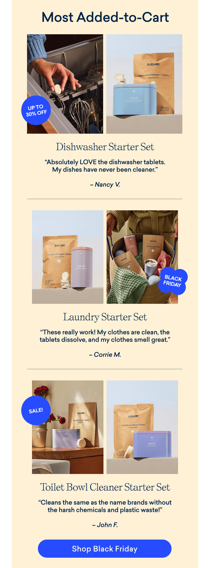
What We Love
✔ Smart use of social proof. Featuring “Most Added-to-Cart” products with real customer quotes builds trust and urgency.
✔ Consistent visual structure. Each product section mirrors the others with photos, testimonials, and badges, making the scroll feel intuitive.
✔ Cohesive color system. The beige and blue tones maintain brand warmth while signaling eco-luxury.
What We’d Do Differently
❌ The “Up to 30% Off” and “Sale” badges are inconsistent in color and placement. Standardizing them would improve visual flow.
❌ The product quotes could be paired with short benefits. For example, “Cleaner dishes, zero waste” reinforces why these are top sellers.
❌ A “Shop All Bestsellers” CTA after the product grid could capture those who want more than one category.
❌ The “Most Added-to-Cart” header works, but adding a short subline like “Join thousands switching to cleaner essentials” could build social proof even further.
Footer Block
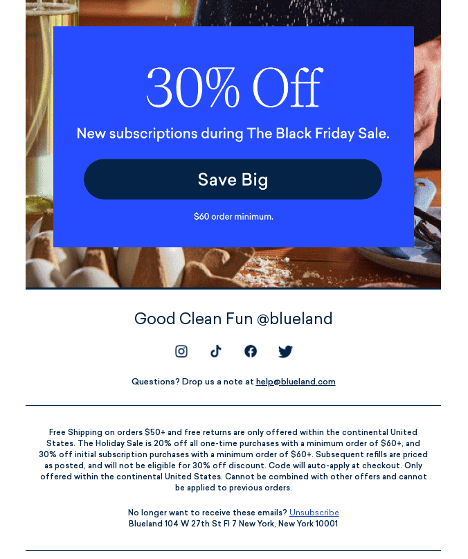
What We Love
✔ Clean transition into a secondary promo. The blue 30% Off subscription banner stands out and neatly reinforces the main offer.
✔ Clear contact info and social links. Makes the brand feel approachable and community-oriented.
✔ Cohesive tone to the end. “Good Clean Fun @blueland” is a friendly, signature sign-off that matches the brand’s voice.
What We’d Do Differently
❌ Add a CTA at the very bottom. A final “Shop the Sale” or “Start Saving” button would give skimmers one last action point.
❌ The blue subscription section could use a visual of the products included. Adding imagery here would make the offer feel more tangible.
❌ The legal copy is necessary but heavy. Shortening or formatting it with line breaks could make the close feel less dense.
Final Thoughts: What Email Marketers Can Learn
Blueland’s email is a great example of purpose-driven promotion done right. It sells without shouting, using clean visuals, authentic reviews, and a message that aligns perfectly with its brand values.
💡 3 Quick Wins to Steal for Your Next Black Friday Campaign
✅ Lead with your mission. Reframe discount events to reflect your brand’s values instead of blending into the noise.
✅ Pair testimonials with clear benefits to make social proof more actionable.
✅ Always end with a final CTA. it’s your safety net for skimmers and mobile readers.
Stop Letting Broken Tracking Kill Your Klaviyo Flows
You’ve got your Klaviyo flows live.
They look great. They seem to work.
But here’s the part most brands miss: a lot of those emails never even send.
Here’s why 👇
A shopper clicks your Instagram ad, adds to cart in the in-app browser… and leaves.
Klaviyo never sees the event... so no email, no recovery.
The same thing happens when someone switches devices, shops in a different browser, or returns after cookies expire.
The result:
📉 Missing events
📉 Missing emails
📉 Missing revenue
It captures 100% of events directly from Shopify (even when Klaviyo doesn’t) and stitches sessions together with persistent shopper profiles.
That means your flows finally fire when they’re supposed to, and every abandonment moment gets a second chance to convert.
What you get:
✅ More tracked events
✅ More triggered flows
✅ 2–3× more revenue from abandonment emails
Bonus:
TrackBee also uses your Klaviyo data to strengthen ad targeting across Meta, Google Ads, TikTok, and Pinterest; giving algorithms a cleaner signal on who your buyers really are.
Klaviyo sends the emails.
TrackBee makes sure you actually send them.
👉 Connect TrackBee today and start reclaiming lost revenue.
👀 Industry Intel: UI Shifts, Beauty Trends, and Discovery Behaviors on Social
This week’s platform updates reflect where user attention is headed... toward immersive, social-first discovery. Instagram continues to center Reels and messaging in its interface, while Snapchat reveals how Gen Z beauty shoppers are navigating purchases through community, tech, and creators.
Instagram's New UI Centers Reels and DMs
Instagram is rolling out a refreshed UI that places Reels as the second tab and DMs as the third, allowing users to swipe between key sections. Stories and the main feed remain first, but Instagram chief Adam Mosseri confirms that Reels and messaging now dominate user behavior. The change is already being tested in India and on iPad, where some versions open straight into Reels. Mosseri says the update is focused on “your favorite spaces,” and while legacy feed posts still serve a role in brand discovery, Reels and Stories continue to be the primary growth engines.
💡 Why it matters: Instagram is officially optimizing for short-form video and private sharing. If Reels aren’t already your top priority on IG, they should be now. Expect the feed to fade further in visibility as video becomes the platform’s front door.
Snapchat’s Beauty Shoppers Want Premium, Tech-Enabled Discovery
Snapchat’s new report, based on a 9,000-person survey with WPP and Ipsos, reveals that beauty shoppers (especially Snap users) are more open to trying premium products, using tech like AI for recommendations, and chatting with friends about purchases on-platform. Daily Snapchatters are 2.4x more likely to use tech in their personal care journey and 1.6x more likely to discuss beauty buys via social platforms. Despite deal-seeking habits, shoppers continue to explore trends and trust social influence, particularly from creators perceived as experts.
💡 Why it matters: Snapchat continues to position itself as a powerful discovery tool for beauty and personal care. For brands, this data reinforces the value of immersive content, peer conversation, and creator reviews... especially when paired with smart technology and personalization.
👨💻 The Hiring Vault
Email & Retention Marketing Manager, Boston, MA: Beam
Director of Lifecycle Marketing, Washington, DC: Everyday Dose
Ecommerce Marketing Manager, New York, NY: Dr. Squatch
Digital Marketing Manager, Austin, TX: Nulo Pet Food
Email Marketing Lead, Peachtree Corners, GA: Guardian Sports
Director, Lifecycle Marketing, Los Angeles, CA: Little Sleepies
Director, Lifecycle Mktg, New York, NY: Saks Global
That's a wrap for today!
Appreciate you hanging with Chase and me. We hope you found something you can put to work ASAP.
If you did, don’t keep it to yourself! Send ecomemailmarketer.com to your favorite DTC marketer and get them in on the action.
Catch you next time!
🤘 Jimmy Kim
PS - Your next best customer might be reading this right now. Want in? Email Jimmy to sponsor this newsletter and more.
Love this newsletter but want to receive it less frequently? Let us know by clicking here!
Reply