- eCom Email Marketer
- Posts
- Clarity Beats Cleverness in DripDrop’s Zero Sugar Plus Launch
Clarity Beats Cleverness in DripDrop’s Zero Sugar Plus Launch
When the best brands hit send, Inboox saves it for you. 👻 Be the first to access the AI-driven database with over 1M real emails & actionable insights.
Hey, it's Chase and Jimmy here.
Most product launches try to do too much.
DripDrop went the opposite direction. One product. One promise. Repeated until it stuck.
In this breakdown, we’re looking at how DripDrop introduced Zero Sugar Plus using clarity, consistency, and restraint and why that approach often outperforms louder, more complicated launches.
Also inside:
✔️ Email research shouldn’t take hours.
✔️ Inbox Index: What winning eCom emails look like right now
Let’s jump in👇
Email research shouldn’t take hours.

But between inbox clutter, screenshots, and outdated swipe files, it usually does.
That’s why we built Inboox.ai. An AI-powered database of 1M+ real Shopify emails designed to help you find what works in minutes, not days.
Search real campaigns, explore full HTML, review send-time and performance insights, and spot trends across the brands that are winning right now.
Get started for free >> Access now
Clarity Beats Cleverness in DripDrop’s Zero Sugar Plus Launch
DripDrop did not overthink this launch. They focused on one thing and repeated it until it stuck. Faster hydration, zero sugar, and a formula built for real life.
Across four emails, the brand leaned into clarity over hype, repetition over novelty, and strong visual consistency to introduce Zero Sugar Plus without overwhelming subscribers. The result is a launch that feels simple, credible, and easy to act on.
Below is a breakdown of how each email works, where it could be stronger, and what other brands can learn from this rollout.
1. Get ready: You wanted more + it’s coming soon
Focus: Building anticipation and capturing early intent
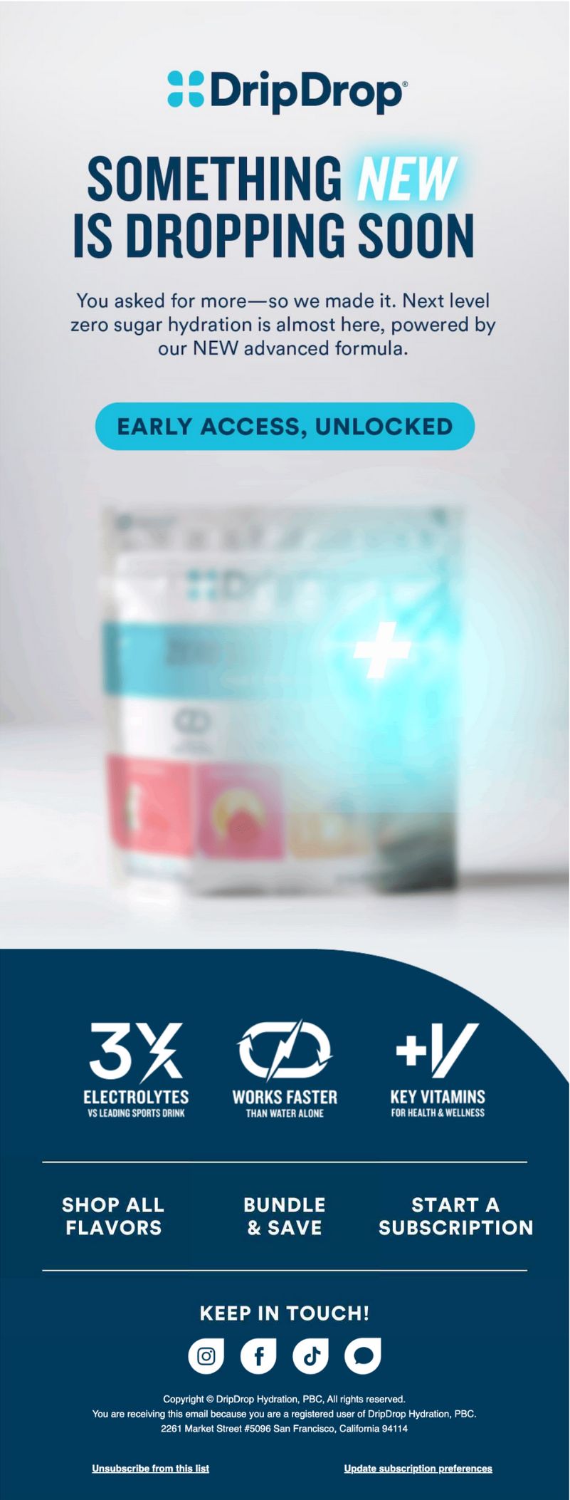
Why This Works:
Clear teaser framing that acknowledges customer demand instead of inventing urgency
Early access CTA gives high intent subscribers something to do right now
Minimal copy and soft blur imagery create curiosity without over explaining
Opportunities for Improvement:
Visual hierarchy makes the CTA easy to miss on fast scrolls
Multiple secondary links compete with the primary early access action
2. One day left: the drop you don’t want to miss
Focus: Countdown driven urgency before launch

Why This Works:
Strong temporal framing with a single clear moment to care about
Repetition of the early access CTA reinforces behavior without feeling spammy
Consistent design language builds recognition across inbox sends
Opportunities for Improvement:
Benefit hierarchy could be tighter so the core value lands faster
Social proof like early interest or waitlist momentum could strengthen urgency
3. Zero Sugar Plus just dropped
Focus: Official product reveal and value framing
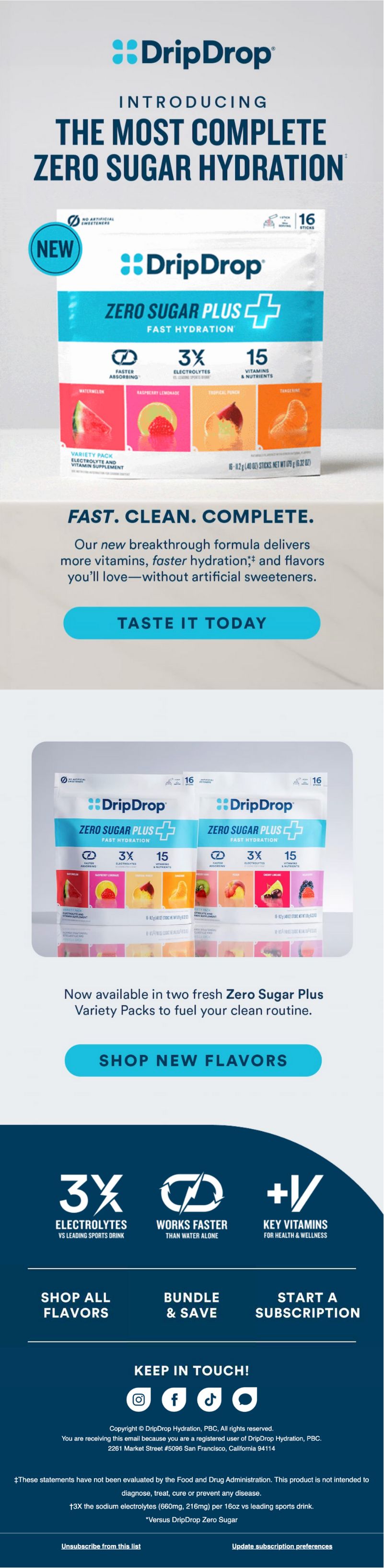
Why This Works:
Clear headline immediately communicates what is new
Product imagery does the heavy lifting without clutter
Benefit callouts are concise and easy to scan
Opportunities for Improvement:
Visual hierarchy could guide the eye more clearly from headline to CTA
A short use case callout could help shoppers quickly self identify
4. What makes Zero Sugar Plus different?
Focus: Education and differentiation
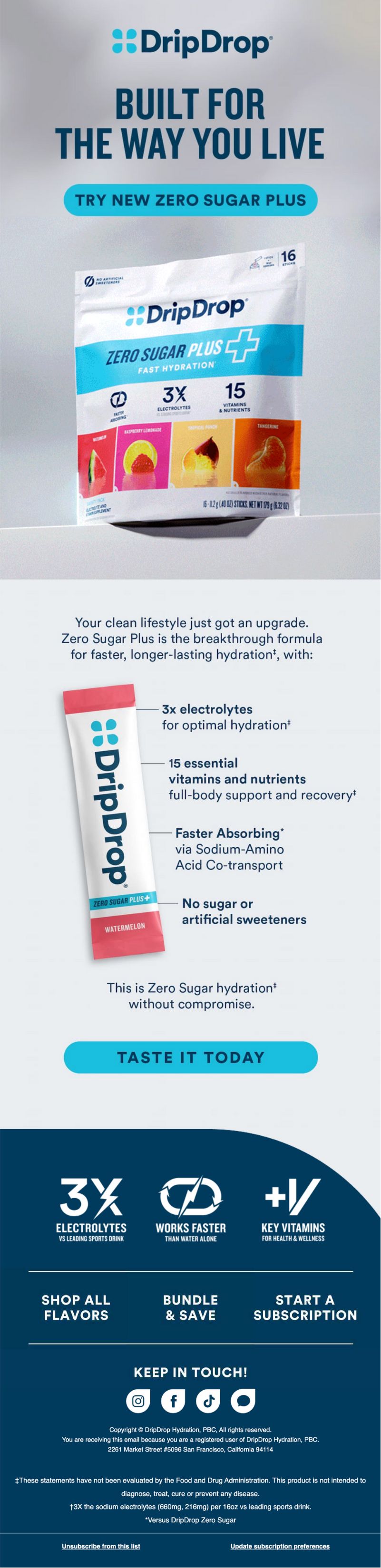
Why This Works:
Feature breakdown reinforces credibility without sounding clinical
Comparison language positions the product against alternatives without naming them
Clean layout supports learning instead of distracting from it
Opportunities for Improvement:
The education is strong but long for mobile readers
Adding light iconography or visual dividers could improve scan speed
5. Hydration That Works As Hard As You Do
Focus: Converting interest with lifestyle validation and a first purchase incentive

Why This Works:
Strong lifestyle imagery immediately shows the product in action rather than explaining it
Clear 20 percent off callout lowers the barrier for first time buyers
Doctor developed positioning reinforces trust and credibility for new subscribers
Repeated value framing connects faster hydration to real world use cases like workouts, recovery, and long days
Opportunities for Improvement:
The email is visually dense, making it harder to quickly scan the core value props
Multiple CTAs and repeated product sections create friction instead of guiding the reader toward one clear next step
The offer could feel more personal with light contextual cues based on how the subscriber entered the list
What DripDrop Gets Right
Clarity Over Cleverness: Every email answers the same question from a slightly different angle. What is this and why should I care. That repetition builds confidence.
Design Consistency: The visual system stays tight across sends. Subscribers never have to reorient themselves or decode a new layout.
Single Product Focus: No distractions. No bundling confusion. No side promotions. Just one product, one message, repeated with intent.
Where There’s Room to Push Further
Stronger First Impression Hierarchy: Several emails rely on strong copy but could benefit from more aggressive visual prioritization to guide the eye.
More Contextual Personalization: The launch works broadly, but light segmentation based on past purchase or behavior could sharpen relevance.
Momentum Signals: Adding cues like popularity, early demand, or customer reactions would help hesitant buyers move faster.
Final Takeaway
DripDrop proves that product launches do not need theatrics to perform. When the product is clear, the value is obvious, and the message is consistent, restraint becomes a strength.
This is a launch built for trust, not tricks. And that is exactly why it works.
Key Takeaways for Brands
✔ Keep the message simple and repeat it confidently
✔ Use design consistency to reduce cognitive load
✔ Give subscribers one clear action at a time
✔ Let education support conversion instead of replacing it
✔ Trust that clarity converts better than clevernes
Meme of the week
When "new year, new me" takes on a whole new meaning. Raise your hand if you’re TIRED 🙋

Inbox Index: What winning eCom emails look like right now
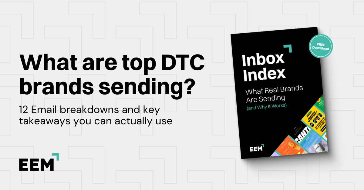
You don’t need more “best practices.” You need real examples you can swipe, adapt, and send. Inbox Index is our curated breakdown library of ecommerce emails that actually pull their weight, so you can stop guessing and start building campaigns + flows with proven angles.
What’s inside:
High-performing welcome, promo, and post-purchase examples
Subject lines, creative angles, and offer framing you can copy
Quick notes on why each email works (so you can remix it for your brand)
Grab the Inbox Index here → Access Free
Annnnd that’s a wrap for this edition!
Thanks for hanging with Chase and me. Always a pleasure to have you here.
If you found this newsletter helpful (or even just a little fun), don’t keep it to yourself! Share ecomemailmarketer.com with your favorite DTC marketer. Let’s get them on board so they don’t miss next week’s drops.
Remember: Do shit you love.
🤘 Jimmy Kim & Chase Dimond
PS - Your next best customer might be reading this right now. Want in? Email Jimmy to sponsor this newsletter and more.
Love this newsletter but want to receive it less frequently? Let us know by clicking here!
Reply