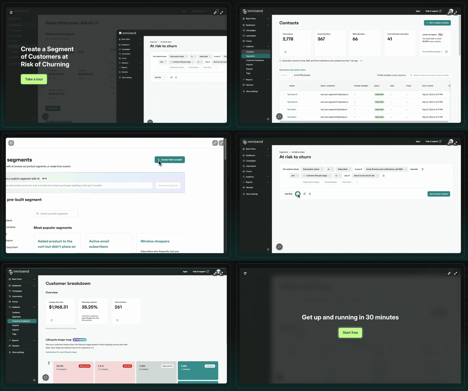
The best launch email we’ve read this year barely mentions the product.Kind Patches sells a patch you stick on your arm, which is a hard thing to explain and a harder thing to buy, so they didn’t try. They spent the whole email picking a fight with the tub of green powder already sitting in your cupboard. The comparison chart in the middle sells harder than any paragraph could, and it still leaves money on the table in 3 specific places. Full teardown below, block by block. 👇 Also inside → The AI that builds your Q4 segments for you, in plain English → The layer that writes a different version of every send for every subscriber → A $100M run rate and a lawsuit turned into an ad campaign
|
The breakdown Kind Patches launched by arguing with green juiceKind Patches sells vitamin patches, and Super Green is their take on a greens routine without the drink. The hard part of that launch isn’t explaining the product, it’s that everybody they’re selling to already owns a tub of green powder. So the email barely explains the product. It spends its length on why a patch beats a powder, and that choice is the whole lesson. The header
What works: a “Limited Stock” banner at the top tells you this is a drop that can sell out, which is urgency without a countdown timer. “Meet Super Green!” and “a new kind of Greens routine” frame it as an upgrade to a habit you already have. The hero shows the patch on skin, so nobody has to guess what a patch means. The line “wear your greens instead of drinking them” does the positioning in 6 words, and “our first drop is tiny” does the urgency in 5. What we’d change: there’s no price anywhere, so the first number anybody sees is at checkout. And the hero is a hand holding a plant, when somebody wearing it at the gym or on a flight would make the use case land. The body, and the chart doing all the work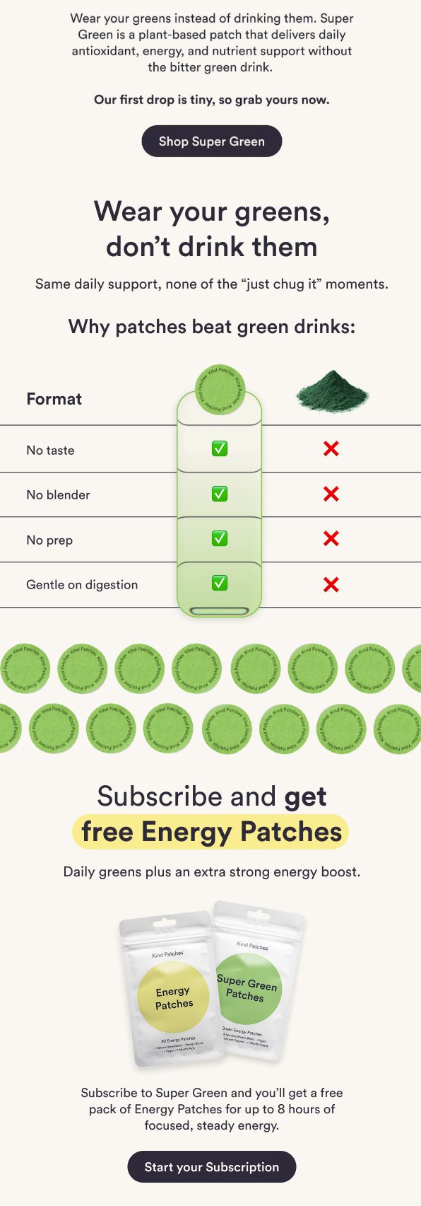
What works: “Wear your greens, don’t drink them” repeats the one idea. The subhead names the objection out loud, “same daily support, none of the just chug it moments”, which is how you talk to somebody who already dislikes the thing they currently use. Then the comparison chart: no taste, no blender, no prep, gentle on digestion, green check for the patch, red X for the drink. You read it in 3 seconds without touching the body copy. The subscribe offer under it bundles free Energy Patches, so the ask comes with something attached rather than just a discount. What we’d change: the chart is 4 for 4, which reads like marketing. Give the drinks 1 honest win, hydration or fiber, and the rest of it gets more believable. There’s also no button right under the chart, which is the exact moment somebody is most convinced. And no reviews anywhere, on a product whose entire pitch is that an unfamiliar format works. The footer
What works: clean, uncluttered, nothing competing with the message, legal where it should be. What we’d change: there’s no way to reach the rest of the catalog, so anybody not sold on Super Green has nowhere to go. No free shipping, returns or guarantee line either, which is cheap reassurance for a first-time buyer, and no social links for a product that is genuinely fun to look at. Steal this for your next launch- ✓ Position against the thing they already own, not against nothing. The chart is the asset, not the copy.
- ✓ Use limited stock for launch urgency instead of a timer, since a first drop selling out is believable in a way a clock isn’t.
- ✓ Put the button directly under the moment of persuasion, not 2 blocks later.
- ✓ Give the alternative 1 honest win, because a 4 to 0 chart reads like an ad and a 3 to 1 chart reads like the truth.
- ✓ Show a price. A launch email with no number makes people wait, and waiting is how a tiny first drop stays in stock.
The positioning here is better than most launches get. The 3 fixes are all trust, and trust is what turns the people who already believe you into people who bought. |
The DTC wins: Perelel hit a $100 million run rate on a subscription baseThe women’s supplement brand crossed $100 million annualized in August, 6 years after launching, and told Glossy revenue has roughly doubled every year. The detail worth stealing is the shape of it: direct is still 85% of sales and 90% of that is subscription, with Amazon making up the rest after growing 4x in 18 months. They hired Rare Beauty’s former CMO to take it from here. A retention program that holds 90% of your direct revenue in subscriptions is what lets you hire for growth instead of patching churn. Caraway got sued, then put the lawsuit in the adsGroupe SEB and Meyer sued Caraway in February over its non-toxic claims, and Caraway made the lawsuit the campaign, with billboards near Groupe SEB’s New Jersey office, wild postings across New York, and a petition that has passed 50,000 signatures, per Modern Retail. Their new coffee maker, out September 22nd, has done 7 figures and sold out its first production run. There’s still active litigation, including a separate consumer class action the brand says has no merit. Most brands go quiet when the legal letter arrives. The upside of not going quiet is that your customers find out what you stand for. |
Reply