- eCom Email Marketer
- Posts
- ✨ Glow Goals: How KraveBeauty Used Email & SMS to Power Their Holiday Sale
✨ Glow Goals: How KraveBeauty Used Email & SMS to Power Their Holiday Sale
Plus, an AI prompt you’ll want to steal and tips to scale smarter
Jimmy Kim & Chase Dimond
June 19, 2025
Access over 25+ hours of retention marketing modules to become a certified email & SMS marketer. Use code: SCHOOLSOUT & get certified for $200 off!

Hey it's Chase and Jimmy here!
Memorial Day may be behind us, but smart brands are already applying what worked to their July 4th planning.
This week, we’re breaking down how KraveBeauty pulled off a seamless, glow-worthy campaign across email and SMS. Think: TSA-friendly messaging for long-weekend travelers, tiered discounts to boost AOV, and a clear, consistent experience that felt more brand than blowout.
Get the full breakdown below, plus a few takeaways your own team can swipe for Q3.
Also inside:
👥 How segmentation can boost conversion rates by 27.6%
🤖 AI Power-Up: Lighten Your Workflow Load
Let’s get into it 👇
👥 Segmentation is your unfair advantage—here’s how to use it

Segmentation is the not-so-secret weapon behind higher engagement, better conversion rates, and more efficient email revenue. Omnisend pulled together 15 proven strategies (with real brand examples) for slicing your list and sending smarter—from cart abandoners and one-time buyers to VIPs, seasonal shoppers, and quiz takers.
Here’s what’s inside:
How segmentation boosts conversion rates by 27.6%
15 expert-backed ways to segment plus, real-world examples
The difference between behavioral, transactional, lifecycle & engagement-based segmentation
How to use Omnisend’s prebuilt segments (or build your own from scratch)
Pro tips on list cleaning, device-based UX, and reactivating your most valuable sleepers
🙃 Meme Drop
It’s the calm before the storm…

✨ Glow Goals: How KraveBeauty Used Email & SMS to Power Their Holiday Sale
KraveBeauty went all in for Memorial Day with a well-coordinated campaign across email and SMS that felt fresh, on-brand, and effective.
From the moment early access kicked off, the messaging was consistent, the visuals were vibrant, and the product education was baked right in. And while we think there was room to do more with SMS, their channel alignment and sequencing helped create a smooth, shopper-first experience.
Let’s break it down.
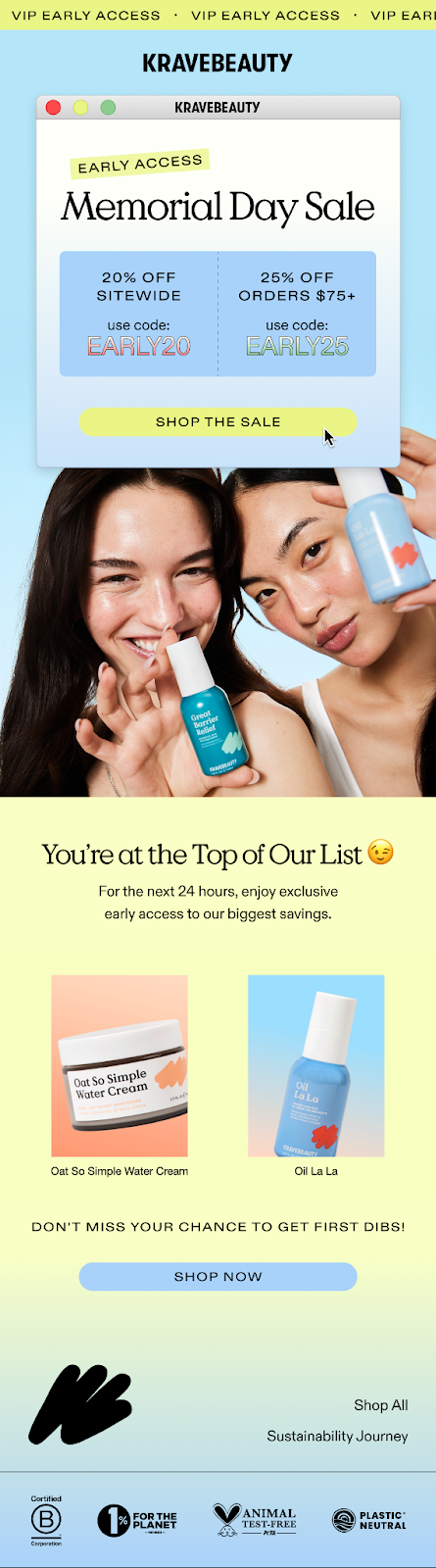
📩 Email #1: Early Access Announcement
Wins
✅ Strong VIP Framing: Leading with “You’re at the top of our list 😉” immediately makes the customer feel like part of an exclusive group; a smart way to kick off early access.
✅ Dual Discount Structure: Offering both 20% off sitewide and 25% off $75+ gives shoppers flexible entry points, while subtly increasing AOV.
✅ Consistent Design Language: The layout, colors, and messaging mirror their site and product packaging, making the entire brand experience feel cohesive.
✅ Product Placement with Purpose: Highlighting bestsellers like Oat So Simple Water Cream and Oil La La gives the reader an easy “add to cart” moment without overloading them.
Areas to Upgrade
🚀 Lack of Countdown or Urgency Reinforcement: While the 24-hour early access window is mentioned, there’s no timer or bold visual cue to drive urgency home.
🚀 Split Discount Codes Might Confuse Some Shoppers: The two-code approach requires a bit more thinking. A dynamic code based on cart value or a one-click apply would smooth this out.
🚀 CTA Hierarchy Could Be Sharper: The “Shop Now” and “Shop the Sale” CTAs are both clear, but slightly repetitive. A unique CTA could better align with the VIP tone (e.g., “Get Early Access”).
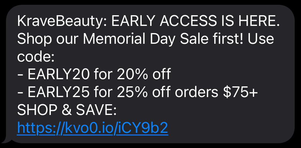
💬 SMS #1: Early Access Kickoff
Wins
✅ Short, Punchy, On-Brand: The message is concise, clear, and keeps the same tone as their emails; fun but not overhyped.
✅ Strong Timing Alignment: The SMS hit around the same time as the early access email, reinforcing the campaign across channels without spamming.
✅ Focused CTA: Linking directly to the sale creates a frictionless experience. No fluff, just action.
Areas to Upgrade
🚀 No Personalization or Product Mention: Even a single product name or customer name would’ve gone a long way toward making the message feel more tailored.
🚀 Could’ve Used an Emoji or Visual Cue: A small visual nudge (🛍️, ✨, 🧴) could help grab attention and tie into the tone of the campaign.
🚀 Opportunity for More Engagement: This SMS felt like a one-off. A second message teasing low stock or sharing a product pick could’ve extended the value of the channel across the sale window.
📩 Email #2: Memorial Day Sale Now Live
Wins
✅ Clean, Branded Design: The layout mirrors KraveBeauty’s aesthetic; calm, playful, and product-forward. The email feels like an extension of their website.
✅ Benefit-Driven Product Sections: Each product featured includes a mini benefit blurb (e.g., “Hydrates skin without heaviness”), helping shoppers understand value beyond price.
✅ Discount Structure Reinforced: Repeating the 20%/25% offer with clear, simple phrasing helps shoppers quickly process the deal; no mental math required.
✅ Skimmable, Modular Format: Well-spaced sections and clear visual hierarchy make this easy to navigate on desktop or mobile.
Areas to Upgrade
🚀 Still No Urgency Framing: This is the main sale announcement, but there’s no mention of when it ends, limited quantities, or “while supplies last” language to push action.
🚀 CTAs Could Be More Playful: While the buttons are visually clear, the copy ("Shop Now") is a bit flat. More playful CTAs like “Glow Time,” “Treat Your Skin,” or “Bag the Bestsellers” could better match the brand voice and spark more clicks.
🚀 Missing Social Proof: A review snippet, rating stars, or UGC element would help reassure first-time buyers and increase confidence mid-sale.
🚀 No SMS Cross-Promo: Once again, there's no mention of SMS. No invite to sign up, no tie-in for reminders or restocks. A missed chance to grow that list while interest is high.
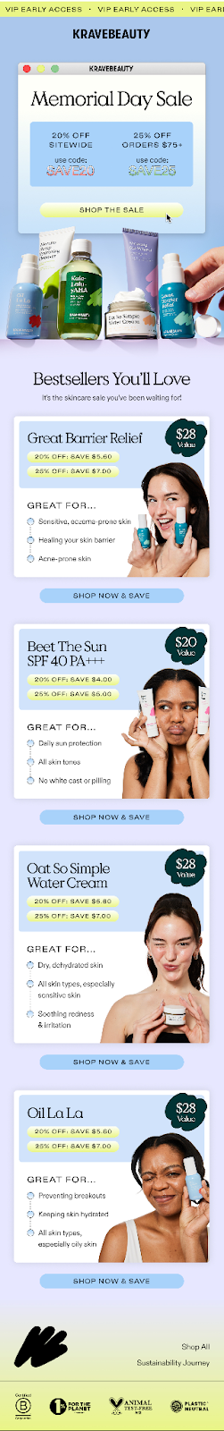
📩 Email #3: Mid-Sale Reminder
Wins
✅ Bold Visual Hierarchy: The oversized “20% OFF SITEWIDE / 25% OFF $75+” header makes the offer impossible to miss; smart move for a reminder email.
✅ Simple, Focused Messaging: This email trims the fluff and gets straight to the point. One main message, one action = clarity.
✅ Consistent Branding: The soft neutral background and minimalist layout keep it aligned with KraveBeauty’s calm, skincare-forward aesthetic.
Areas to Upgrade
🚀 No Timing Cue or Reminder: A mid-sale reminder is a great time to say “Only X days left!” or “Sale ends tomorrow.” This email doesn’t mention when the sale ends, which limits urgency.
🚀 Could Re-engage Inactive Shoppers: This was a good chance to include a product recommendation, restock alert, or even a “Still thinking it over?” section to win back hesitant buyers.
🚀 Same Recycled CTA: Once again, we’re seeing the standard “Shop Now” CTA. Rotating in a new phrase, even something as simple as “Glow Up Starts Here,” could refresh attention.
🚀 No Personalization Layer: Even just referencing the shopper’s last viewed product or category (“Still eyeing Great Barrier Relief?”) could drive stronger conversions here.
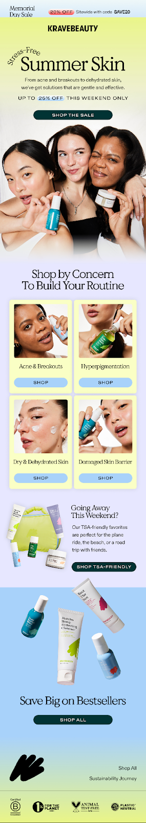
📩 Email #4: Stress-Free Summer Skin
Wins
✅ Timely, Travel-Themed Framing: “Stress-Free Summer Skin” paired with “TSA-friendly sizes” is a smart seasonal tie-in, especially for Memorial Day, when many customers are prepping to travel.
✅ Subtle Lifestyle Positioning: This email shifts from pure discounts to use case; positioning products as essentials for on-the-go, summer-ready skin routines.
✅ Reinforces Bestsellers With Value: KraveBeauty brings back popular products but presents them in a new context (travel-friendly + benefits), helping avoid email fatigue.
✅ Soft, Soothing Design Matches Message: The visual tone is lighter and more breathable, mirroring the idea of calm, simple skincare.
Areas to Upgrade
🚀 Still Lacks a Sense of Urgency: Despite being later in the campaign, there’s no mention of the sale ending soon. This would be a great place to say “last chance” or “just 24 hours left.”
🚀 Could Push Cross-Sell More: A TSA-friendly product focus is perfect for bundling. To take it a step further, suggesting a mini-routine or “add this too” could help increase AOV.
🚀 Repetitive CTA Still in Play: “Shop Now” again. At this point in the sequence, using something seasonal like “Pack Your Glow” or “Grab & Go” would be more engaging.
🚀 SMS Reminder Opportunity Missed: This theme would’ve worked perfectly as a short-and-sweet SMS (“Sale’s still on. TSA-approved skin wins inside ✈️”), but no tie-in here.
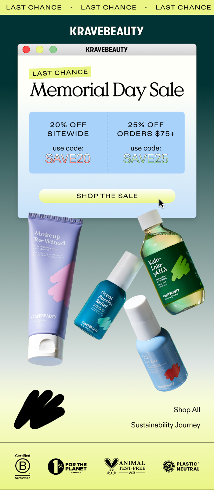
📩 Email #5: Final Hours — Sale Ending
Wins
✅ Clear, Deadline-Driven Subject Line: “Final Hours ⏰ Up to 25% Off Sitewide!” nails it. A bold discount paired with a time-sensitive nudge that feels urgent but not pushy.
✅ Focused, Visual Message: The big “Last Chance” header and gif at the top paired with the simplified layout make it clear what the shopper needs to do next. No distractions, just a clean push to convert.
✅ Strategic Simplicity: At this stage in the sale, less is more. KraveBeauty strips it down to just what matters (discount, CTA, and timing) giving hesitant buyers a frictionless way to say yes.
Areas to Upgrade
🚀 Still Could Benefit From a Countdown Visual: A graphic timer or exact end-time (e.g. “ends tonight at 11:59PM PT”) would add a psychological deadline and drive urgency.
🚀 Missing Product Hooks: Even a mention of low stock or top-sellers could have tipped some carts into checkouts. This email is more reminder than persuasion.
🚀 Same CTA Language Again: “Shop Now” gets the job done, but it’s been used every time. “Glow Before It’s Gone” or “Last Call to Stock Up” might make the final nudge feel fresher.
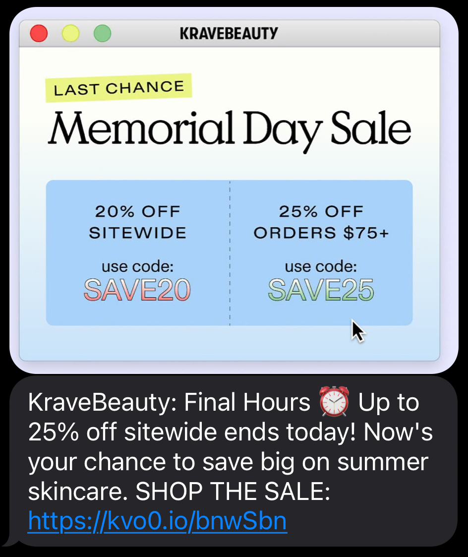
💬 SMS #2: Last Chance Text
Wins
✅ Tight, Timely, Effective: The message gets straight to the point: sale ending soon, up to 25% off, here’s your link. Exactly what SMS is for.
✅ Strong Alignment With Email Timing: The coordination between this SMS and the “Final Hours” email creates a unified, omnichannel push that increases the odds of conversion.
✅ Well-Paced in the Flow: With only two total SMS sends, this second one feels intentional (not spammy) and adds urgency at the exact right moment in the campaign.
✅ Mobile-First Frictionless: Short copy and a single, direct CTA make this easy to click and convert; no extra info, no distractions.
Areas to Upgrade
🚀 Tone could better match the brand: The message is clear and timely, but reads like a default SMS template. A touch of KraveBeauty’s playful voice (“Glow now or regret later 💅”) would’ve made it feel more distinctive.
🚀 Opportunity for dynamic urgency: Adding a time-sensitive cue (like “only hours left” or “ends at midnight”) would’ve helped dial up the urgency in a crowded promo window.
🚀 Lack of product or category callout: A quick mention of a fan-favorite product (“Don’t miss Great Barrier Relief”) could’ve sparked interest and encouraged click-through for shoppers who needed a nudge.
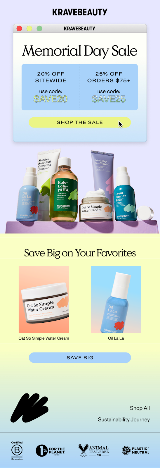
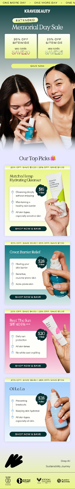
📩 Email #6: Extended Memorial Day Sale
Wins
✅ Strong urgency headline: “EXTENDED Memorial Day Sale” paired with a final-day banner creates a clear sense of urgency for last-chance shoppers.
✅ Side-by-side offer blocks: Clear visual comparison of 20% and 25% off tiers encourages shoppers to bump their cart value to hit the higher discount.
✅ Product education is still present: Despite being a hard promo push, the email still highlights product value with features, pricing, and skin-type suitability.
✅ Strategic use of bright visuals and diverse hands: Adds warmth and inclusivity while anchoring each product to a relatable use case.
Areas to Upgrade
🚀 Subject line missed a creative hook: “Final Hours ⏰ Up to 25% Off Sitewide!” was functional but could’ve been more playful or branded to stand out in a crowded inbox.
🚀 “Save Now” CTA lacks spark: The main hero CTA blends into the background and feels generic. Something like “Glow ‘Til Midnight” or “Snag Your Faves” could’ve added flair.
🚀 Repetitive content from earlier emails: While consistent, some copy and visuals feel recycled from earlier sends in the flow. A unique spin for the extended sale could improve engagement.
What they’re doing well
✅ KraveBeauty created a cohesive, visually-driven Memorial Day campaign with strong alignment between email and SMS.
✅ The use of tiered discounts, TSA-friendly positioning, and product mini-guides made the promos feel both educational and shoppable.
✅ Their clean layout and punchy messaging strike a great balance between conversion and brand tone.
Where they could improve
🛠️ Subject lines and CTAs across the campaign were sometimes flat; missing opportunities to add more branded voice or urgency.
🛠️ A few emails reused similar imagery or copy, which may reduce engagement for frequent readers.
🛠️ Adding a clear loyalty or post-sale hook could help turn deal buyers into long-term customers.
Final Thoughts + Key Takeaways
KraveBeauty’s Memorial Day sale campaign did a lot right: it was timely, well-branded, and balanced fun with function. From TSA callouts to targeted SMS, the flow felt thoughtful; though a few sharper creative choices could’ve pushed it even further. Here’s what other brands can take away:
Use tiered discounts to drive higher AOV, but make the difference between tiers crystal clear.
Don’t phone in your CTAs: strong design + branded language = more clicks.
Product mini-guides help shoppers feel confident, especially when sales are sitewide.
Highlight seasonal angles (like holiday travel or weather shifts) to stay relevant and drive urgency.
Consistency is key; but small creative shifts across emails can keep things feeling fresh.
🤖 AI Power-Up: Lighten Your Workflow Load
AI isn’t just for writing subject lines or segmenting your list—it can clean up the back end, too.
Here’s how to offload the admin:
Automated reporting: Skip the spreadsheet grind. Have AI send weekly summaries or campaign performance recaps written in plain English (not analyst speak).
Workflow suggestions: AI can spot gaps and recommend your next best move, like testing an upsell email or re-engaging cold leads.
Creative asset management: Let AI tag, sort, and surface your top-performing content so you’re never digging through folders to find that graphic again.
Time saved: Content calendars, reports, internal updates? All AI-assisted. So you can spend more time optimizing (and less time organizing).
→ Use AI to clean up the mess behind the scenes because “organizing files” was never in your job description.
Annnnd that’s a wrap for this edition!
Thanks for hanging with Chase and me. Always a pleasure to have you here.
If you found this newsletter helpful (or even just a little fun), don’t keep it to yourself! Share ecomemailmarketer.com with your favorite DTC marketer. Let’s get them on board so they don’t miss next week’s drops.
Remember: Do shit you love.
🤘 Jimmy Kim & Chase Dimond
Love this newsletter but want to receive it less frequently? Let us know by clicking here!
Reply