- eCom Email Marketer
- Posts
- Huha’s Rose Print Launch: A Soft Drop With Strong Retention Bones
Huha’s Rose Print Launch: A Soft Drop With Strong Retention Bones
When the best brands hit send, Inboox saves it for you. 👻 Access the AI-driven database with over 1.5M real emails & actionable insights.
Hey, it's Chase and Jimmy here.
Limited edition launches don't need to be a cause for chaos.
Huha launched their Rose Collection with calm and intention. No manufactured urgency. No discount crutch. Just good pacing, strong visuals, and letting their community do some of the selling.
Let's break down what worked, what didn't, and what you can steal for your next launch.
Also inside:
✔️ Retention doesn’t need more hacks. It needs a reset
✔️ Thinking about switching ESPs in 2026? Start here.
Let’s jump in👇
Retention doesn’t need more hacks. It needs a reset

Somewhere along the way, retention turned into a pile of “best practices,” 47 flows, and a spreadsheet that only one person on your team understands.
Retention Redefined is your permission slip to stop over-engineering and start focusing on what actually moves repeat purchases.
This free ebook breaks down:
What to fix before you add another flow
Where most brands quietly leak revenue
How to simplify your email + SMS strategy without dumbing it down
👉 Grab the Retention Redefined download and clean up your retention strategy.
Huha’s Rose Print Launch: A Soft Drop With Strong Retention Bones
Huha’s Rose Collection emails are a good example of how to stretch a limited edition launch without overloading the inbox. Let’s break down how each email worked, where it could be tighter, and what retention teams can steal from it.
1. Get your first look 🌹
Focus: Early tease and anticipation building

What Worked Well:
Strong visual restraint. One hero image does the heavy lifting
“Launching tomorrow” sets a clear mental timer without pressure
Reminder CTA captures high intent without forcing a purchase
Opportunities for Improvement:
Visual hierarchy is soft. Headline, subhead, and CTA blend together, making it harder to scan quickly
No expectation setting for what makes this drop special beyond aesthetics
2. NEW: Morning & Midnight Rose 🌹
Focus: Product reveal and differentiation

What Worked Well:
Clear naming between Morning Rose and Midnight Rose helps decision making
Product grid makes it easy to browse silhouettes fast
Limited edition badge reinforces scarcity
Opportunities for Improvement:
Benefits are implied but not explicit. A quick callout on why these differ from core styles would add clarity
The grid is visually dense. Breaking sections into tighter blocks could improve scanability
3. JUST IN: Rose Print Undies 🌹
Focus: Social proof and validation

What Worked Well:
UGC callouts and comments instantly reduce hesitation
Community language reinforces that this launch was customer driven
Visual variety keeps the scroll interesting
Opportunities for Improvement:
Social proof appears mid email. Pulling it higher could anchor trust sooner
No directional CTA tied to specific styles shown in UGC
4. Florals aren’t forever, Cherie…
Focus: Urgency and last call messaging

What Worked Well:
Plain text format stands out after multiple designed sends
Personalized greeting adds warmth and familiarity
Shipping deadline creates real urgency without sounding salesy
Opportunities for Improvement:
Copy is strong but skimmability suffers. Shorter paragraphs or spacing would help
CTA is text based only. A button could capture faster clicks
5. Florals for winter?
Focus: Style justification and extended relevance

What Worked Well:
Reframes florals as seasonless, not trend driven
Mix and match section encourages multi item carts
Consistent color palette reinforces brand cohesion
Opportunities for Improvement:
Product grid repeats similar visuals. Highlighting complementary items could increase AOV
No light education on fabric or comfort benefits tied to colder months
6. Florals, florals, florals
Focus: Community momentum and final push

What Worked Well:
Heavy UGC presence makes the collection feel lived in
“Not forever” framing reinforces scarcity without countdowns
Strong emotional close to the launch sequence
Opportunities for Improvement:
Eyes do not know where to land first. Clear section headers could guide attention
Links and CTAs visually compete with imagery instead of standing out
What Huha Gets Right
Anticipation without overhyping. The brand lets visuals and community do the talking
Strong balance between designed emails and plain text, keeping the inbox experience fresh
Clear limited edition framing that feels honest, not manufactured
Community driven storytelling that reinforces trust and loyalty
Where They Miss the Mark
Visual hierarchy across product grids can feel dense and hard to scan
Benefits are often implied instead of stated, which may confuse newer subscribers
Some CTAs compete with imagery instead of anchoring the action
Final Takeaway
Huha proves that you do not need aggressive discounts or daily sends to make a limited drop work. By mixing anticipation, community validation, and a well timed plain text email, they create momentum that feels natural and brand first.
Key Takeaways for Brands
✔ Use teaser emails to collect intent, not force early conversions
✔ Let community feedback and UGC carry credibility during launches
✔ Alternate between designed and plain text emails to reset attention
✔ Make benefits obvious, especially for limited edition products
✔ Guide the eye with stronger hierarchy so great visuals do not compete with clicks
If your next launch feels like it needs “more,” this is a good reminder that clarity and pacing will always win.
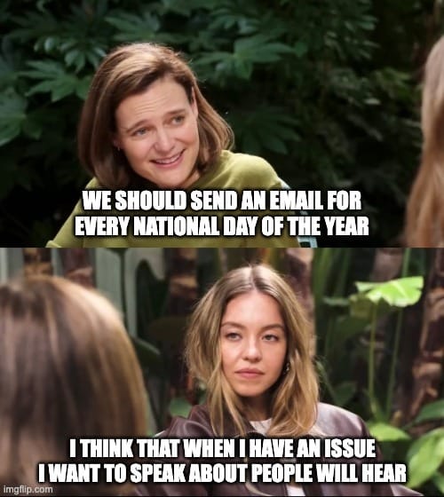
Meme of the week
Email marketing vs Personalized email marketing:
Thinking about switching ESPs in 2026? Start here.
If email and SMS are your growth engine, the platform behind them matters more than ever. Omnisend put together a fast, practical breakdown comparing Omnisend and Klaviyo; focused on the features that actually shape performance day to day.
You’ll see where each platform works best, where teams tend to hit friction as they scale, and which setup helps you move faster with less overhead.
👉 Watch the comparison and see which platform makes more sense for your 2026 plans
Annnnd that’s a wrap for this edition!
Thanks for hanging with Chase and me. Always a pleasure to have you here.
If you found this newsletter helpful (or even just a little fun), don’t keep it to yourself! Share ecomemailmarketer.com with your favorite DTC marketer. Let’s get them on board so they don’t miss next week’s drops.
Remember: Do shit you love.
🤘 Jimmy Kim & Chase Dimond
PS - Your next best customer might be reading this right now. Want in? Email Jimmy to sponsor this newsletter and more.
Love this newsletter but want to receive it less frequently? Let us know by clicking here!
Reply