- eCom Email Marketer
- Posts
- Kind Patches' Super Green launch: Positioning a new product by attacking the alternative
Kind Patches' Super Green launch: Positioning a new product by attacking the alternative
Chase Dimond & Jimmy Kim
April 13, 2026
The retention playbook built from $200M in email and SMS revenue is here.
→ Unlock the Vault
Hey it’s Chase and Jimmy here!
Is green juice really worth the blender cleanup, the chalky taste, and the fridge space? Kind Patches doesn't think so.
This launch email for their Super Green product is structured around comparison. Instead of just telling you what Super Green does, they spend most of the email explaining why the patch format beats the powder format. It's a smart move when you're introducing something unfamiliar to people who already have a solution they're used to.
Let's break down what's working and where there's room to improve.
Also inside:
✔️ Six months from now you're going to look back at your email program and barely recognize it.
✔️ You're bleeding money on ads while your best customers sit there... make it make sense.
✔️ Hiring vault: 6 New retention marketing job ops
Let’s get into it.
Six months from now you're going to look back at your email program and barely recognize it.
The campaigns will be consistent. The welcome flow will actually convert. You'll have a system you trust instead of a calendar you dread.
And when someone asks how you turned your list into a real revenue channel you'll point to the moment you stopped guessing and started working from a proven playbook.
That's what the eCom Retention Vault does.
50 proven campaigns built from watching $200M+ flow through email and SMS across thousands of eCom brands. Real signup forms, welcome emails, and SMS examples from 20+ top performing brands. Copywriting frameworks the best teams use to ship at scale. Design principles pulled from 10,000+ high performing campaigns. And a private community of 350+ retention marketers who are building the same thing you are.
The version of you that has all of this looks a lot different than the version still figuring it out alone.
Kind Patches' Super Green launch: Positioning a new product by attacking the alternative
Kind Patches' Super Green launch: Positioning a new product by attacking the alternative
Kind Patches launched their Super Green product, and instead of just listing what it does, they built the entire email around why patches beat green drinks.
No blender cleanup. No chalky taste. No prep time. Just stick it on and go.
It's a smart positioning play when you're introducing an unfamiliar product format to people who already have a solution they're used to. The comparison chart makes it impossible to miss the point.
The positioning is strong and the urgency feels real, but the execution leaves conversions on the table. No pricing anywhere, no social proof backing up the claims, and no details about subscription terms to reduce friction.
Today we're breaking down what makes this comparison approach work and where adding trust signals could drive more sales.
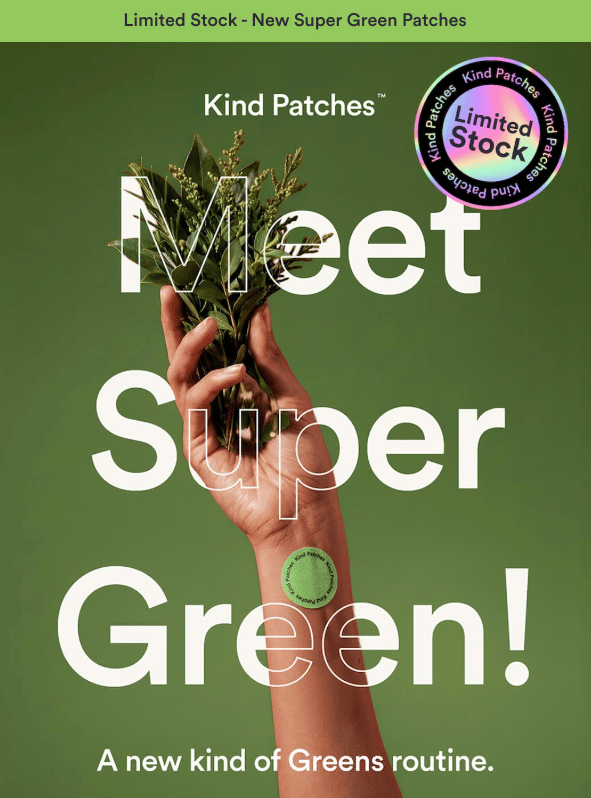
Header Block
The top of the email introduces the new product with urgency and clear positioning.
What We Love
The "Limited Stock - New Super Green Patches" banner creates immediate urgency. You know this is a launch and it might sell out, reinforced by the prominent limited stock badge.
"Meet Super Green!" with the exclamation point adds energy, and the tagline "A new kind of Greens routine" positions this as an upgrade to what people already do.
The hero image shows the product on skin. You see exactly how it works and where it goes, which removes confusion about what a "patch" actually means.
The intro copy hits benefits and differentiation in one block. "Wear your greens instead of drinking them. Super Green is a plant-based patch that delivers daily antioxidants, energy, and nutrient support without the bitter green drink." Then pushes urgency: "Our first drop is tiny, so grab yours now."
The CTA is clear. "Shop Super Green" tells you exactly what you're clicking to do.
What We'd Do Differently
There's no pricing. Adding "Starting at $X" would help people decide faster and reduce surprise at checkout.
The hero image could show lifestyle context. Right now it's a hand holding a plant with patches on the wrist. Showing someone working out, traveling, or in their daily routine would make the use case more concrete.
Body Block
Here's where they make the case for patches over drinks with a comparison chart, then close with a subscription offer.
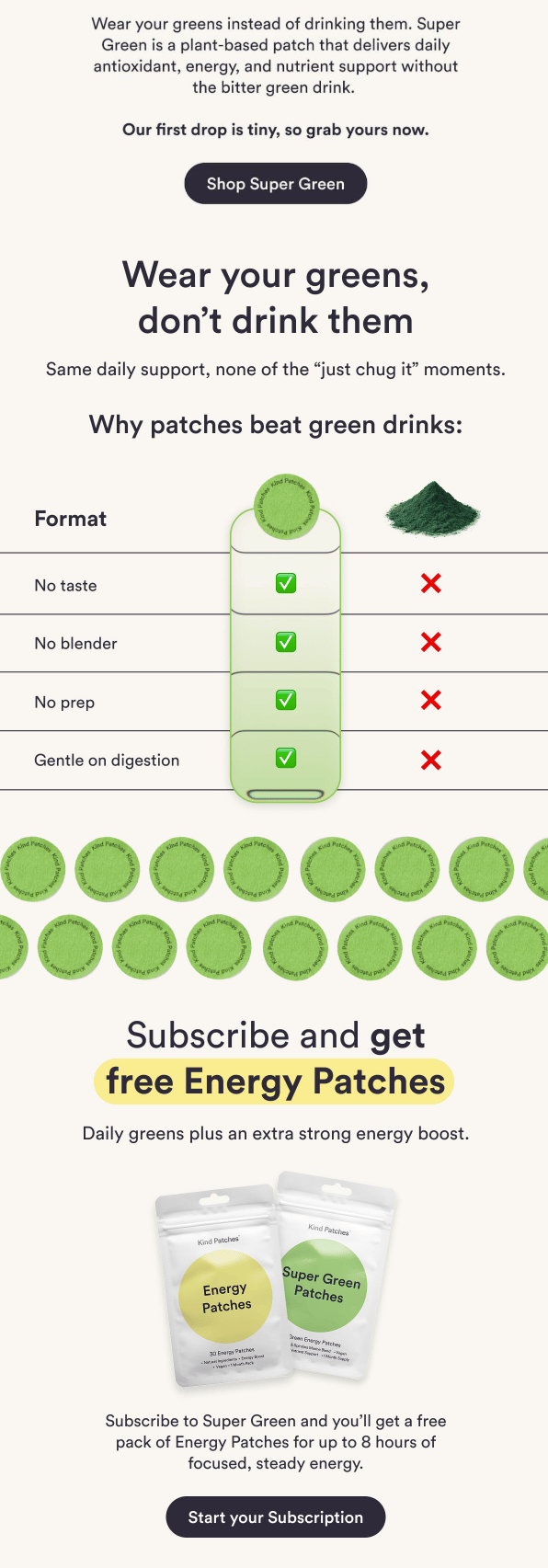
What We Love
"Wear your greens, don't drink them" is a perfect section header. It reinforces the core message again.
The subhead addresses skepticism. "Same daily support, none of the 'just chug it' moments." This acknowledges that green drinks aren't pleasant and positions patches as the solution.
The comparison chart is genius. No taste, no blender, no prep, gentle on digestion. Each row shows patches winning with a green checkmark vs. drinks losing with a red X. It's impossible to miss the point.
The visual is clean and scannable. You can process this in three seconds without reading any body copy.
"Subscribe and get free Energy Patches" is a clear value prop. You know exactly what you're getting and why subscribing matters, with the yellow highlight drawing your eye immediately.
The subscription offer bundles Smart. "Daily greens plus an extra strong energy boost" connects two products in a way that makes sense together.
What We'd Do Differently
The chart feels a little one-sided. Adding one benefit that drinks have (like "Hydration" or "Fiber") would make it feel more credible instead of purely marketing.
There's no CTA after the comparison. You just made a compelling case for patches, but there's no "Try Super Green" button right there to capitalize on that momentum.
No social proof. Customer testimonials or reviews about the patch format would add credibility to these claims.
The subscription section lacks details. Adding one line of benefits or reassurance would reduce friction.
No pricing anywhere. Showing the monthly cost or the savings vs. one-time purchase would help people decide.
Footer Block
Kind Patches wraps up with minimal navigation and legal info.
What We Love
The footer is clean and uncluttered. It doesn't compete with the main message.
Legal disclosures are present and accessible.
What We'd Do Differently
There's no navigation to other products. If someone isn't interested in Super Green but wants to explore other patches, they have no clear path.
No trust signals. Adding "Free shipping," "Easy returns," or "Satisfaction guaranteed" would help hesitant buyers take the next step.
No social links. For a product this visual, Instagram and TikTok would be natural places to show the patches in action.
Where This Email Works
Let's zoom out and see where this fits in the bigger email strategy.
New Product Launches: This is a textbook launch email. Clear positioning, urgency, comparison to existing solutions, and multiple CTAs.
Re-engagement Campaigns: New product launches are great for identifying who's still interested. Seeing who opens and clicks on "what's new" helps segment active vs. dormant subscribers.
Category Education: Great for introducing an unfamiliar product format (patches) by comparing it to something people already know (green drinks).
Health and Wellness Audiences: Perfect for people who already take supplements but are looking for more convenient options.
Final Thoughts: Strong positioning, needs more trust signals
This email does a great job of making patches feel like the obvious choice over green drinks. The comparison chart is clear, the urgency is real, and the subscription offer adds value.
But it's leaving some conversions on the table. There's no pricing anywhere, no social proof to back up the claims, and no reassurance about subscription terms. Adding customer reviews, showing prices, and explaining subscription details would help convert more interested browsers without losing the strong positioning angle.
3 Quick Wins to Steal Next Time
✓ Use comparison charts to position new products against familiar alternatives
✓ Create launch urgency with limited stock callouts, not just countdown timers
✓ Bundle new products with bestsellers in subscription offers to increase perceived value
You're bleeding money on ads while your best customers sit there... make it make sense.
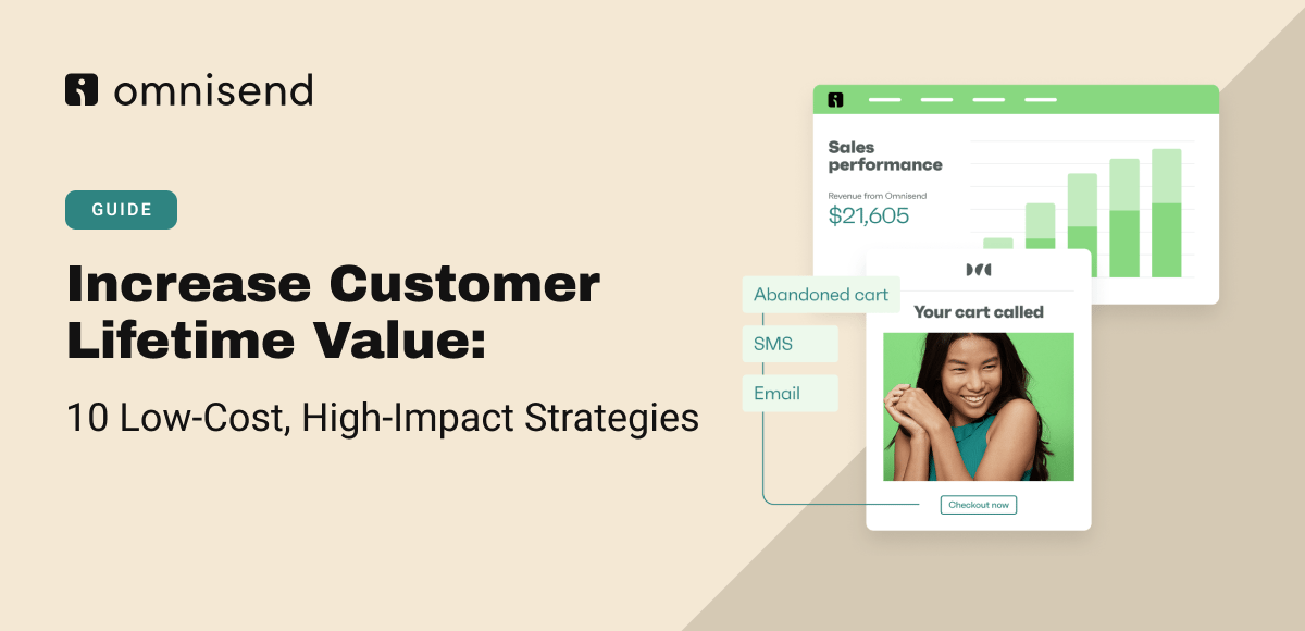
Acquiring new customers costs more every year. Meanwhile, most of your revenue comes from a small base of loyal repeat buyers. This Omnisend guide breaks down 10 strategies to increase customer lifetime value without inflating your ad budget.
Here's what works:
Post-purchase email sequences convert 22x better than standard marketing emails
Automated SMS gets 147% higher click rates and 118% better conversions than campaigns
Lifecycle segmentation treats VIPs, at-risk customers, and one-time buyers differently—not the same generic blast
Replenishment reminders prevent customers from running out and buying from competitors
Exit-intent popups and cart abandonment flows recover 87% of all automated orders
The guide also covers loyalty programs, subscription strategies, product bundling, and win-back automations timed to your consumption cycle. → Read the full guide
*Sponsored
The Hiring Vault
Senior Manager, Lifecycle Marketing, Los Angeles Metropolitan Area: Birdy Grey
Retention Marketing Manager, Los Angeles, CA: Everlane
Sr. Lifecycle Marketing Manager, Los Angeles, CA: Frank & Eileen
Senior Lifecycle Marketing Strategist, Activation & Conversion, Pleasant Grove, UT: Pura
Lifecycle & CRM Marketing Manager, Chicago, IL: Purple Carrot
Digital Marketing Associate, Lifecycle & CRM, New York, NY: Ralph Lauren
That's a wrap for today!
Appreciate you hanging with Chase and me. We hope you found something you can put to work ASAP.
If you did, don’t keep it to yourself! Send ecomemailmarketer.com to your favorite DTC marketer and get them in on the action.
Catch you next time!
🤘 Jimmy Kim
PS - Your next best customer might be reading this right now. Want in? Email Jimmy to sponsor this newsletter and more.
Love this newsletter but want to receive it less frequently? Let us know by clicking here!
Reply