🎓 eCom Email Certified | 25+ hours that take a retention marketer from running the sends to setting the strategy. See what's inside → |  | Mon 10/12 · Ed 434 | Surreal’s abandoned cart email is the funniest one we’ve read, and it still leaves carts on the table.Loud branding, a FEED ME button, a comparison chart that makes every other cereal look like dessert. It is a genuinely great email. It also never says your name, never says what you left behind, and puts one button at the very bottom. Three fixes, block by block, on the flow that matters most between now and Black Friday. 👇 Also inside → Your reporting routine, reduced to one sentence you type → More output per retainer without more hours from your team → Fresh retention and lifecycle roles, all posted in the last week → The prompt to run on your cart flow before Black Friday traffic starts
| Your ESP now takes orders
Your ESP now takes orders. Omnisend’s MCP plugs your account into ChatGPT or Claude, both live now, and the AI goes in and does the work instead of describing it. It reads the account, then builds the segment and writes the campaign off what it finds. Three to try on day one: → “Which campaigns made the most revenue last month, and what did the winners have in common?” → “Check my deliverability and tell me what’s hurting it.” → “Build a segment of people who bought once and haven’t opened in 90 days, then draft the win-back.”
Connect it once and after that... just ask. Your Monday reporting routine is now one sentence. → Give it a try *Sponsored | The teardown Surreal's abandoned cart email: all personality, half the mechanicsSurreal’s abandoned cart email is just as bold and quirky as the brand itself. Eye catching fonts and colors, witty one liners, plenty of personality in the inbox. But fun alone doesn’t bring carts back, conversion does. Does this email have the right mix of charm, clarity and persuasion? Let’s break it down. The header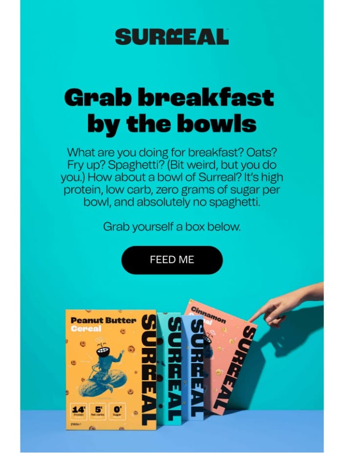
What works: the branding is loud and clear, from the logo to the playful fonts, bold colors and photography. You know this is a Surreal email. “Grab breakfast by the bowls” is catchy, and the subheading balances humor with benefits: high protein, low carb, zero sugar. “FEED ME” is witty, high contrast and dead center, impossible to miss. The cereal boxes show flavor variety at a glance and nudge shoppers to explore. What we’d change: the copy is fun but dense, and breaking it into two shorter paragraphs would make it skim. There is also no personalization anywhere, which is odd in an abandoned cart email: no first name, no mention of what they left behind. And where is the actual cereal? A close up in a bowl would sell the breakfast idea harder than the boxes do. The body, and the chart doing the selling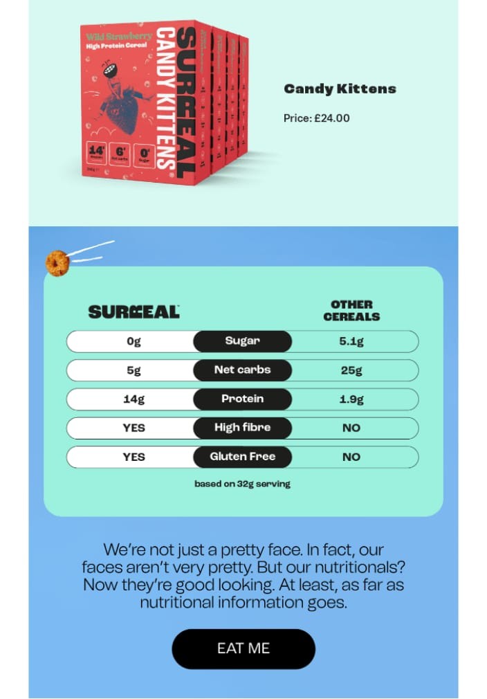
What works: a big, high quality image of the exact product they left behind, so nobody has to remember what caught their eye. The comparison chart does the real work: 0g sugar against 5.1g, 14g protein against 1.9g, painfully obvious why Surreal wins. The humor holds, and the layout is clean with good contrast and plenty of white space. What we’d change: the product sits there with no context, where a line like “here is what you liked” would carry the reader in. There is no button next to it either, just a price, so somebody can scroll past the thing they wanted without realising they could buy it right there. No review, no rating, nothing that answers hesitation, and almost nothing about the flavors themselves. The footer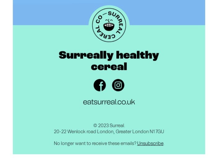
What works: short, on brand and centered, with the essentials and no fluff. Social icons and a website link give other ways to stay connected, and the opt out stays friendly. What we’d change: nothing links anywhere useful. A shop all link, FAQs or shipping details would hold somebody who is not buying this particular box. And there are no trust signals, which work harder in an abandoned cart email than almost anywhere else: secure checkout, free shipping, easy returns. The verdictEnergy, personality and strong branding, with the conversion mechanics missing. Personalization, a button beside the abandoned item, and a reason to act would turn a great looking email into a recovering one. Steal thisAddress the reader by name and name what they left behind, so it reads as a nudge rather than a campaign. Add urgency or social proof, a selling fast label or one review. And put more than one way back in: if the goal is to recover the cart, every section should be clickable, not just the bottom. | More output per retainer, same hours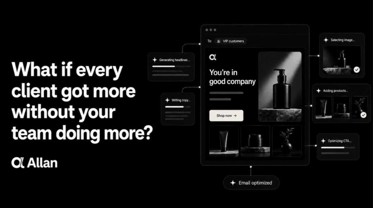
Your clients want more email than your team has hours to build. More campaigns, more segments, more tests. The asks keep coming, the month stays the same length, and something good always gets cut to fit. Allan changes that. Your team stocks each client’s library once, the heroes, copy, CTAs, and offers, and Allan assembles the best version for every subscriber at send time and learns from what lands. Coverage climbs while build hours stay flat, and it sits on top of Omnisend and Klaviyo so nothing in the stack moves. That’s a lot more output per retainer, on a cleared 1 to 3x range in revenue per recipient (a ballpark, not a guarantee). The 30-day trial includes the creative, so there’s almost no lift to start. → Start free at getallan.com *Sponsored | The Hiring Vault: 8 retention roles that went live this weekSkincare, supplements, denim, pajamas, and a meal subscription. Every one of them sells physical things online, so the work is the work you already know how to do. → Sr Manager, Lifecycle & Retention Marketing at Ursa Major Skincare, Remote → Director of Retention at Alpha Lion, Remote → Director of Lifecycle Marketing at Munchkin, Los Angeles, CA (Hybrid) → Digital Marketing Sr. Manager, Lifecycle & CRM at Ralph Lauren, New York, NY (On-site) → Senior Manager, Lifecycle Marketing at LAKE, Savannah, GA (On-site) → Manager, CRM & Campaigns at True Religion, El Segundo, CA (Hybrid) → Retention Manager, Curlsmith at Helen of Troy, Greater Boston (Hybrid) → Senior Lifecycle Marketing Manager at CookUnity, New York, NY (On-site)
| AI prompt of the week: Our article today is about an abandoned cart email that has the personality and not the mechanics. This is the prompt we’d run on yours before Black Friday traffic starts. Paste it into ChatGPT or Claude with your own cart email underneath: Copy this prompt You are a retention marketer reviewing an abandoned cart email. I will paste the copy and describe the layout. Score it out of 10 on each of these, with the reason in one line: (1) does it name the shopper and the exact item they left behind, (2) is there a reason to act now, like a stock level, a review or a selling fast signal, (3) can the reader click back to the cart from every section rather than only the bottom, (4) are there trust signals near the CTA, such as shipping, returns or secure checkout. Then rewrite the email with the lowest two scores fixed, keeping my brand voice exactly as it reads in the original. Do not add a discount. |
The no discount line at the end matters. Ask any model to improve a cart email and it reaches for a percentage off first, which trains your list to abandon on purpose. | That’s a wrap for today! Appreciate you hanging with Chase and me. If this gave you something to fix in your cart flow, send ecomemailmarketer.com to your favorite DTC marketer. Remember: Do shit you love. 🤘 Jimmy Kim & Chase Dimond PS: Your next best customer might be reading this right now. Want in? Email Jimmy to sponsor this newsletter and more. Want to receive it less frequently? Update your cadence here | | You received this email because you subscribed to our newsletter. |
|
Reply