Studs numbered the ear and let the photo do the sellingStuds sells ear piercings and the earrings that go in them, out of studios and online. The email is a new product drop, which is the most ordinary brief there is, and they did one thing with it that almost nobody does. The full email is here if you want to see it in one piece. 1. The nav is four links long
Best sellers, new arrivals, earscape sets, shop all. No account link, no cart icon, no search, no twelve item mirror of the website. Every one of those four is a way to browse with an intention already attached. The nav in a promotional email isn’t navigation, it’s the escape hatch for the person who doesn’t want the thing in the hero. Four doors beats twelve, because twelve is a decision and four is a glance. 2. The offer sits above the hero, as a number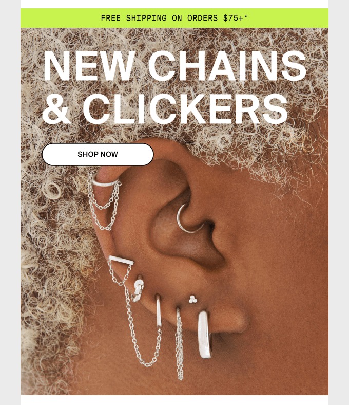
“Free shipping on orders $75+” in a green bar, before anything else loads. Not “free shipping on qualifying orders”. A number you can hold against the thing you’re about to put in the cart. The asterisk takes the terms down to the footer where they belong, instead of hedging the offer in the same breath as making it. Then the hero does three things and stops. It names the products literally, NEW CHAINS & CLICKERS, with no cleverness at all. It gives you one button. And it shows the product on a real ear at a size where you can actually see the chains. Steal thisput the category name in the headline. “Something new just dropped” tells a reader nothing about whether to care. 3. One line of copy, in the customer’s words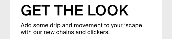
“Add some drip and movement to your ‘scape with our new chains and clickers!” That’s the entire body copy of the email. One sentence. “Scape” is what their customers call an earscape, and Studs didn’t stop to explain it. Writing in the vocabulary your buyers already use is the cheapest way to sound like you belong in the category, and the fastest way to lose the people who don’t. Which is fine. This email isn’t for them. 4. The numbers are the whole email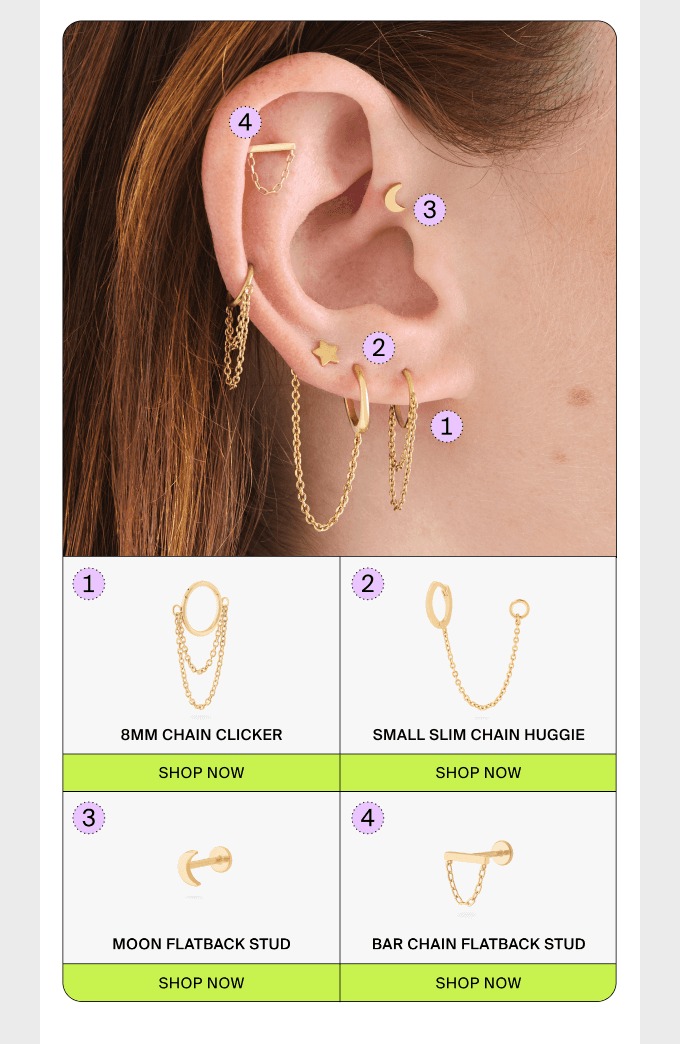
Here’s the bit worth copying. They photographed the full look, dropped a numbered badge on each piece, then repeated those exact numbers in the grid underneath with the product name and its own button. 1 is the 8mm chain clicker. 2 is the small slim chain huggie. 3 is the moon flatback stud. 4 is the bar chain flatback stud. You look at the ear, you want the thing dangling off the top of it, you look down, you find 4, you buy it. Compare that with the normal version of this email, which is the same photo and one SHOP THE LOOK button pointing at a collection page. That version makes the reader do the matching, on a phone, from memory. Most of them won’t. Four cells also means four separate links instead of one, so the click data tells you which piece people actually wanted rather than that they liked the photo. The playthis works for anything that combines. A skincare routine, an outfit, a coffee setup, a supplement stack, a desk. If you have a hero shot with four products in it, number them. 5. The second conversion lives in the footer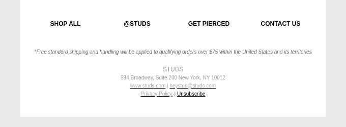
Shop all, @studs, get pierced, contact us. Three of those are normal. “Get pierced” is Studs booking an appointment at a physical studio, sitting in the footer of a product email as a permanent option. It never competes with the body of the email and it’s never missing. If you have a second conversion that isn’t a purchase, a booking, a store visit, a quiz, a referral, the footer is where it lives. What to take into your next drop email✓ Number the pieces in your hero shot and repeat the numbers in the grid below it ✓ Give every product its own link, so the clicks tell you which one they wanted ✓ Put the shipping threshold above the hero, as a number ✓ Name the product category in the headline instead of teasing it ✓ Cut the nav to four links, all of them a way to browse ✓ Park your non-purchase conversion in the footer where it can’t get in the way
None of it needs a new template. The numbered badges are the only thing here your designer hasn’t already built. | 

Reply