- eCom Email Marketer
- Posts
- Plain Jane's St. Patrick's Day email: Product education disguised as a gift guide
Plain Jane's St. Patrick's Day email: Product education disguised as a gift guide
Chase Dimond & Jimmy Kim
March 09, 2026
What has 1.5M emails and never ghosts you? Inboox.ai 👻 >> Get started for free
Hey it’s Chase and Jimmy here!
"Holiday emails" are usually just product grids with a seasonal graphic slapped on top.
Plain Jane's St. Patrick's Day email takes a different angle: it positions CBD as hangover relief, walks you through the product lineup by benefit, then lets you shop by how you want to feel instead of by product type.
It's part gift guide, part product education, part choose-your-own-adventure. The structure is solid for a category where people need help figuring out what to buy, but there are spots where better hierarchy and readability could push conversions higher.
Today we're breaking down what makes this email work and where Plain Jane could tighten execution.
Let's dive in.
✔️ 10 Customer acquisition strategies that actually lower your CAC
✔️ That mental list of retention fixes you keep ignoring? Yeah, let's actually do those.
✔️ Hiring vault: 8 New retention marketing job ops
Let’s get into it.
10 Customer acquisition strategies that actually lower your CAC
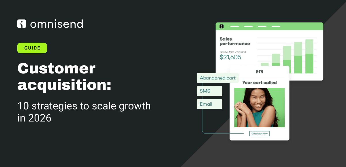
Paid ads are getting more expensive, third-party cookies are disappearing, and iOS privacy updates keep tightening. To scale profitably in 2026, brands need to turn paid traffic into owned relationships through email and SMS (not just keep paying for the same attention).
What's working now:
First-party data capture through popups, quizzes, and checkout opt-ins
AI-powered personalization that triggers relevant messages at scale
Referral programs generating customers at $16 CAC vs. $48 from paid channels
Email marketing delivering 76x ROI and $8-$15 CAC vs. $30-$120 on Google Ads
Localized automations scaling brands across multiple markets without proportional CAC increases
The Omnisend guide includes implementation tactics, channel-specific benchmarks, and real examples from brands that grew email revenue 525% while maintaining a 0.36% unsubscribe rate. Read the full guide.
Plain Jane's St. Patrick's Day email: Product education disguised as a gift guide
Plain Jane sells CBD products, and this St. Patrick's Day email is doing a lot more than just tying products to a holiday. It's educating, guiding, and segmenting all at once.
The email starts with a timely hook (CBD and drinking tips for St. Patty's Day), then shifts into a product showcase organized by benefit, and ends with a choose-your-own-adventure style selection tool. It's a smart structure for a category where people need help figuring out what to buy.
Let's break down what's working and where there's room to improve.
Header Block
Right at the top, Plain Jane connects CBD to St. Patrick's Day in a way that actually makes sense.

What We Love
The headline ties CBD to the holiday without forcing it. "Get Your Green On: CBD and Drinking Tips for St. Patty's Day!" gives you a reason to care beyond just "it's green."
The subheading does real work. It explains the problem (hangovers), offers the solution (CBD), and references the holiday all in one clean block of copy.
The hero CTA is clear. "PARTY SMART WITH CBD" tells you exactly what this email is about.
The product image shows what you're getting. The green packaging and pre-rolls are front and center, which removes any guesswork.
What We'd Do Differently
The layout feels a little cramped at the top. More breathing room around the headline and hero image would make it easier to scan.
There's no urgency. Adding a line like "Order by [date] for St. Patrick's Day delivery" would push people to act now instead of later.
The CTA could be more specific. "PARTY SMART WITH CBD" is fine, but "Shop Pre-Rolls" or "Get St. Patty's Day Ready" would set clearer expectations about where you're going when you click.
Body Block
Here's where they walk you through the product lineup, one category at a time.

What We Love
The "Stress-Free Stash" section gives context. Instead of just listing products, they're telling you what each one does and why it matters for this specific moment.
Each product gets a clear CTA. "SHOP PREROLLS," "SHOP GUMMIES," "SHOP GEL CAPSULES," "SHOP OILS," "SHOP ACCESSORIES"; you can click and buy immediately without hunting.
The variety shows range. Pre-rolls, gummies, gel capsules, oils, accessories; they're covering different formats and preferences, which helps people find what works for them.
The neon green CTAs stand out. They're impossible to miss and consistent throughout the email.
What We'd Do Differently
The product descriptions are light. Adding one line of benefit-focused copy under each product (like "Fast-acting relief" or "Perfect for on-the-go") would help people make faster decisions.
There's no hierarchy. Every product is treated the same, which makes it harder for new customers to know where to start. Labeling one or two as "Best Seller" or "Fan Favorite" would guide indecisive shoppers.
The orange text is hard to read. The headlines like "Eight Pack Delta 8 Hemp Prerolled Joints" and "THC-V Gummies" have low contrast against the white background, which makes them easy to skip.
No social proof. Customer reviews, ratings, or testimonials would add credibility and help people feel more confident buying.
Footer Block
Plain Jane closes with a shipping callout and a unique choose-your-vibe widget.
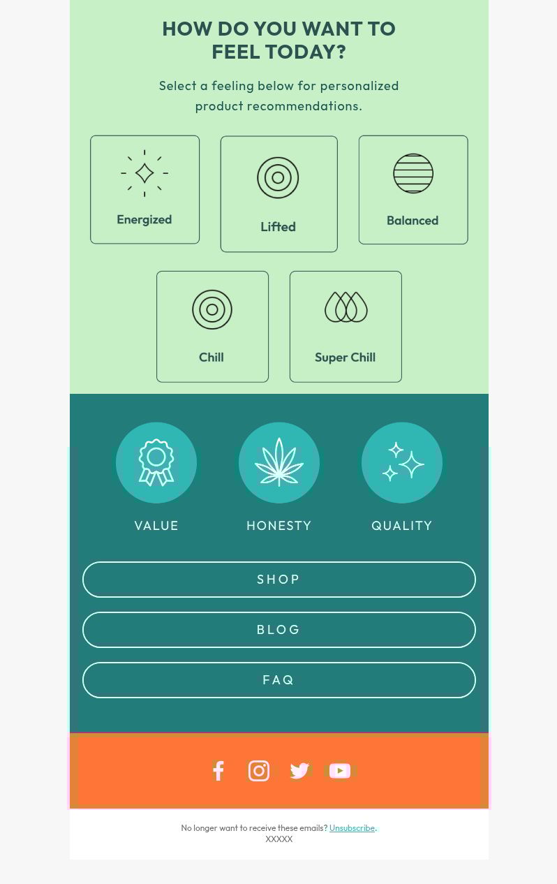
What We Love
The free shipping threshold is clear and prominent. "Free Shipping on Orders Over $39.99 (Excludes Vapes)" removes a common objection right away.
The "How do you want to feel today?" section is a smart segmentation tool. Instead of making people browse by product type, they can shop by desired effect (Energized, Focus, Sleep, Chill, Sweet Chill).
The values, honesty, and quality callouts reinforce trust. It's a quick reminder of what the brand stands for without being preachy.
Navigation is clean and functional. Shop, Blog, FAQ; everything you'd need is right there.
What We'd Do Differently
The "How do you want to feel today?" section could be more prominent. It's a really useful tool, but it's buried at the bottom. Moving this higher in the email (maybe right after the hero) would help more people discover it.
The icons in the "feel today" section need labels. It's not immediately obvious what each icon represents, which adds friction instead of removing it.
There's no final CTA. After all the product showcases and the vibe selector, there's no "Start Shopping" or "Find Your Product" button. People who scrolled all the way down have no clear next step.
The values section feels disconnected. It's nice branding, but it doesn't tie back to St. Patrick's Day or the products you just showed. A line connecting it (like "Quality you can trust, especially when you need it most") would bridge the gap.
Where This Email Works
Let's zoom out and see where this fits in the bigger email strategy.
Holiday Campaigns: This is a solid play for any occasion where CBD ties naturally to the moment (stress, recovery, relaxation). The format would work for New Year's, 4/20, summer travel, etc.
Product Education: Great for brands in categories where people need help understanding what to buy. The use-case framing makes decision-making easier.
New Customer Acquisition: The "How do you want to feel?" section is perfect for people who are curious about CBD but overwhelmed by options.
Final Thoughts: Strong structure, needs better hierarchy
This email does a lot of things right. The product variety is clear, the CTAs are easy to spot, and the vibe selector is a smart way to guide shoppers. It's trying to be helpful instead of just pushing sales, which is the right move for CBD.
But it's working too hard in some places and not hard enough in others. The product descriptions are too light, the orange headlines are hard to read, and the vibe selector is buried when it should be front and center. There's no urgency, no social proof, and no clear hierarchy to guide new customers.
Tighten up the readability, add some trust signals, and move the vibe selector higher in the email, and this would convert a lot harder without losing the educational, helpful tone.
3 Quick Wins to Steal Next Time
✓ Organize products by use case or desired outcome instead of just listing SKUs
✓ Use a vibe or benefit selector to help overwhelmed shoppers find what they need
✓ Make sure your CTAs have enough contrast to stand out and be easily readable
That mental list of retention fixes you keep ignoring? Yeah, let's actually do those.
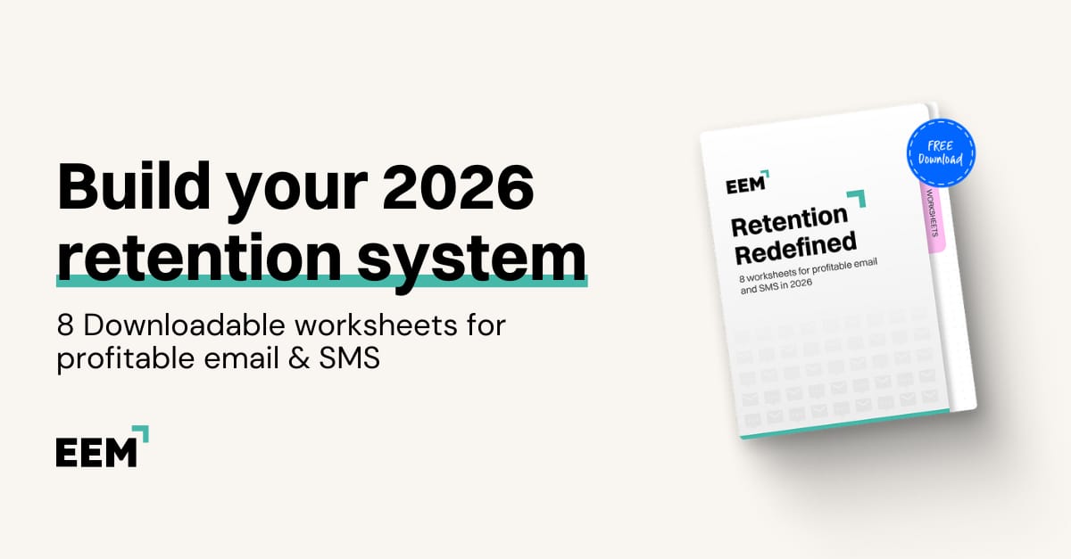
Every marketer has a mental list of retention fixes they "should get to"... rebuild that welcome flow, add SMS to cart abandonment, actually segment beyond one-time vs. repeat buyers. But between campaigns, launches, and putting out fires, it never happens. These worksheets force the issue. They're designed to get you from "I know I need to" to "I actually did it" in the time it takes to drink your coffee.
Inside the worksheets:
Retention Reality Check: score your setup and see exactly where you're bleeding revenue
Flow Build Tracker: stop rebuilding the same three flows and finish the other five
Segmentation Builder: move past basic lists into messaging people actually want
AI Integration Planner: figure out where AI helps and where you still need to show up
The Hiring Vault
Manager, Retention & Engagement, HOKA NA, California, United States: HOKA
Lifecyle Marketing Manager (Email &SMS), Medford, OR: Full Leaf Tea Company
Manager, Email Marketing, New York, United States: Christian Dior Couture
Lifecycle and Retention, Senior Manager, Chicago, IL: Black Girl Vitamins
Director, Lifecycle Marketing, Los Angeles, CA: True Classic
Senior Lifecycle Marketing Specialist III, Portland, OR: Columbia Sportswear Company
Lifecycle Marketing Manager, Los Angeles, CA: Cotton Citizen
Senior Manager, Retention, New York, NY: kate spade new york
That's a wrap for today!
Appreciate you hanging with Chase and me. We hope you found something you can put to work ASAP.
If you did, don’t keep it to yourself! Send ecomemailmarketer.com to your favorite DTC marketer and get them in on the action.
Catch you next time!
🤘 Jimmy Kim
PS - Your next best customer might be reading this right now. Want in? Email Jimmy to sponsor this newsletter and more.
Love this newsletter but want to receive it less frequently? Let us know by clicking here!
Reply