- eCom Email Marketer
- Posts
- Revival’s Abandoned Cart Email: A Gentle Nudge in Neutral Tones
Revival’s Abandoned Cart Email: A Gentle Nudge in Neutral Tones
Plus, free segmentation webinar, latest industry intel, and 7 new retention marketing jobs.
Chase Dimond & Jimmy Kim
August 11, 2025
The 3X sold out DTC event returns to San Diego Sept 22-23 with Gary Vee—grab your ticket at commerceroundtable.com.

Hey it’s Chase and Jimmy here!
Revival just sent an abandoned cart email that feels like a quiet conversation instead of a sales pitch.
No countdown timers, no urgent discounts, just a simple question and the rug you were considering.
It's refreshingly civilized. But does soft-spoken actually drive conversions, or does it get lost in the noise of more aggressive competitors?
This morning, we're analyzing how Revival's gentle approach works – and where adding just a touch more persuasion could help close the deal.
Also inside:
✔️ Think your automation strategy is complete? Think again.
✔️ Recover up to 30% of carts (with zero extra team lift).
✔️ Industry Intel: Target Smarter, Not Harder
✔️ Hiring Vault: 8 New retention marketing jobs
Let’s break it down 👇
Recover up to 30% of carts (with zero extra team lift).

Most abandoned cart flows follow the same formula:
An automated email.
A robotic SMS.
A discount code tossed in for good measure.
And then… nothing.
If you're still relying on bots to bring shoppers back, you’re missing the moment that actually converts: the conversation.
LiveRecover adds a human layer to your cart recovery flow.
Real people (trained sales agents) follow up over SMS in real time to answer questions, overcome objections, and help customers complete their purchase.
What makes it different:
💬 Live agents, not bots
📈 Up to 30% recovery rates
⚡️ Setup in 10 minutes
💰 You only pay when it works
Don’t just send reminders. Start recovering real revenue.
Revival’s Abandoned Cart Email: A Gentle Nudge in Neutral Tones
Revival’s email is calm, clean, and confident. It’s like a friend who gently reminds you that yes, you did fall in love with that rug, and yes, it’s still waiting for you.
But elegance alone doesn't win back carts. Let’s see how Revival pairs pretty with persuasive to nudge shoppers over the finish line.
Header Block

What We Love
✔ Warm, personal tone. The headline “Still thinking about it?” paired with a friendly nudge feels like it’s written by someone who gets you. It’s casual and reassuring, not salesy.
✔ Crystal clear product callout. No mystery here. The exact rug (Gambit) is front and center, complete with price and a styled photo that’s totally Pinterest board goals.
✔ Simple, mobile-first layout. Single column, generous spacing, strong hierarchy. This design works well no matter where you’re opening it.
What We’d Do Differently
❌ Clarify the CTA. “Take another look” sounds gentle, but where does it go? The product page? The cart? Be clear. Something like “Return to Cart” would remove friction.
❌ Give a reason to buy. The email is gentle, but also easy to ignore. A hint of urgency (“Only a few left!”) or a small incentive (“Free shipping for 24 hours”) could drive purchase faster.
🔍 TL;DR: Great design and tone, but the unclear CTA and lack of motivation to buy might cause some shoppers to bounce.
Body Block

What We Love
✔ Design support = clever value add. Not everyone feels confident buying a rug online. Offering human help is a smart way to guide unsure shoppers to a decision.
✔ There’s more to browse. The image slider lets people explore other rugs without leaving the email. It helps keep them engaged if the original pick wasn’t the one.
✔ Secondary CTA that doesn’t compete. “Get Design Support” gives hesitant customers a next step that’s not just “Buy Now.”
What We’d Do Differently
❌ Cut down the text. The support copy is helpful, but it’s crammed into one paragraph. Breaking it into a few bullets would boost readability and keep things skimmable.
❌ Sprinkle some social proof. Where are the happy customers and awards? This section would be even stronger with a review or five-star rating.
❌ What this rug? Is it handcrafted? Ethically sourced? Stain-resistant? Shoppers need more reasons to justify the buy, especially for a high-consideration item like a rug.
🔍 TL;DR: A focused and thoughtful section, but could use a little customer love, product highlights, and better formatting.
Footer Block

What We Love
✔ Short and tidy. The logo, social icons, and helpful links are all here. It’s simple, clean, and doesn’t try to do too much.
✔ Helpful navigation. “Latest arrivals” and “Help center” are smart links to include for shoppers not ready to check out but still exploring.
✔ SMS opt-in. Great move for building your list passively without being annoying.
What We’d Do Differently
❌ Revisit the links. “Free Design Support” shows up twice in the email. The second mention could be swapped for something more useful (like shipping info, returns, or FAQs).
❌ Remove the random fine print. There’s a line about “discounts can’t be stacked,” but… there wasn’t a discount in the first place. Confusing (and awkward).
❌ Add a preference center. Only having an unsubscribe button is a missed opportunity. Give people the option to get fewer emails, not just cut ties completely.
🔍 TL;DR: Clean and functional, but could use a little polish (and a better use of that menu space).
Final Thoughts: What Email Marketers Can Learn
Revival proves that an abandoned cart email doesn’t have to shout to get attention. It’s soft-spoken, thoughtfully designed, and actually helpful.
But to really close the loop, it could use a few tweaks: a clearer CTA, some urgency, and a dash of proof to boost confidence!
3 Quick Wins to Steal for Your Next Abandoned Cart Email
✅ Offer support, not just a sale. A “Need help?” CTA is gold for shoppers who aren’t ready to click “Buy.” It builds trust and gives them a reason to re-engage.
✅ Show off the goods. Big product photo + name + price? Yes, please. Always make it easy for people to remember what they loved.
✅ Clarity wins clicks. Make sure every CTA tells the reader exactly where they’re going, especially in abandoned cart emails, where hesitation is already high.
You don’t need fireworks to bring shoppers back. Sometimes, a soft nudge and a little extra reassurance are all it takes to roll that rug back into the cart.
Think your automation strategy is complete? Think again.
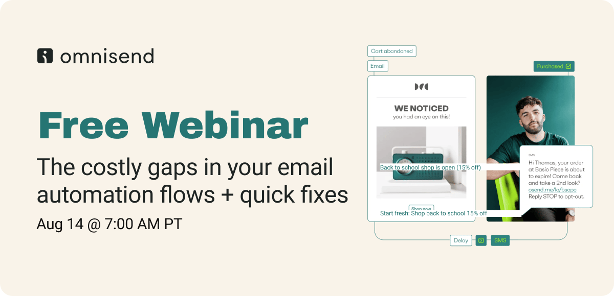
Most brands think they've got email automation figured out: welcome series, abandoned cart, maybe a win-back campaign. But the biggest revenue opportunities are hiding in the gaps between your existing flows. In this Omnisend webinar, you'll discover the essential automations that quietly turn one-time buyers into repeat customers and boost your average order value without you lifting a finger.
What you'll walk away with:
AOV-boosting automation blueprints: Step-by-step flows that increase order values without being pushy or sales-heavy
Real campaign examples you can steal: Actual automations from successful brands, complete with timing, messaging, and triggers you can copy
Quick-win tactics for immediate implementation: Simple additions to your existing flows that can be set up today and start generating revenue this week
👀 Industry Intel: Target Smarter, Not Harder
Platforms are doubling down on better targeting, smarter algorithms, and deeper performance insights, while quietly changing the rules for creators. From Meta’s new ad logic to TikTok’s retargeting and Instagram’s metrics overhaul, here’s what’s new and what it means for your brand.
Meta Introduces “Value Rules” and AI-Powered Ad Upgrades
Meta is rolling out Value Rules for Advantage+ shopping campaigns, allowing advertisers to assign greater value to specific audiences (like repeat buyers or loyalty members). This complements broader AI updates to Meta’s ad delivery system, which now includes click-through prediction upgrades and improved learning models to better match ads with likely converters.
💡 Why it matters: This is big for DTC brands running heavy Meta spend. You can now prioritize high-value customer segments directly within campaign setup, without relying on custom audiences alone. Combine that with more accurate delivery modeling, and you’ve got tighter targeting with smarter spend.
TikTok Launches Engaged Session Retargeting + Community Notes
TikTok’s new Engaged View Retargeting lets advertisers re-engage users who watched your video for at least 6 seconds or visited your site. Meanwhile, TikTok is also rolling out Community Notes (yes, like X) to fact-check misleading content, though it’s limited to select U.S. users for now.
💡 Why it matters: Engaged view retargeting gives performance marketers a clearer mid-funnel playbook on TikTok, where attribution has always been murky. It rewards scroll-stopping creatives and drives follow-up conversions, especially for product demos or seasonal drops. As for Community Notes: it’s a sign TikTok is gearing up for more transparency ahead of U.S. election scrutiny.
Instagram Adds New Follower Metrics and Raises Live Requirements
Instagram is adding follower gains and demographics to its performance dashboard, helping creators and brands better understand who’s following them and when. At the same time, it’s increasing the follower requirement for going live from 0 to 1k.
💡 Why it matters: The new follower metrics give retention marketers and content teams a better way to match spikes in growth to specific content or campaigns. And the Live restriction? It might filter out spam, but it’s also a warning shot to new creators. If you’re building community from scratch, Lives are no longer a quick-start tool.
👨💻 The Hiring Vault
Email Marketing Manager, Seattle, WA: Tommy Bahama
Email Marketing Manager, Springfield, MO: Bass Pro Shops
Email Marketing Manager, Performance Marketing, Seattle, WA: Aritzia
Email & SMS Manager, Costa Mesa, CA: Z SUPPLY
Email Marketing & CRM Specialist, Sugar Land, TX: LostGolfBalls.com
Email Specialist, San Diego, CA: Road Runner Sports
Email and SMS Program Strategy Manager, Portland, OR:
Columbia Sportswear CompanyMgr,Retention Marketing, Austin, TX: Callaway Golf
That's a wrap for today!
Appreciate you hanging with Chase and me. We hope you found something you can put to work ASAP.
If you did, don’t keep it to yourself! Send ecomemailmarketer.com to your favorite DTC marketer and get them in on the action.
Catch you next time!
🤘 Jimmy Kim
Love this newsletter but want to receive it less frequently? Let us know by clicking here!
Reply