- eCom Email Marketer
- Posts
- The Click That Got Away: 5 Browse Abandonment Email Examples (+ Tips)
The Click That Got Away: 5 Browse Abandonment Email Examples (+ Tips)
Plus, this week's top eCom stories in quick clips.
Jimmy Kim & Chase Dimond
August 20, 2025
The 3X sold out DTC event returns to San Diego Sept 22-23 with Gary Vee—grab your ticket at commerceroundtable.com.

Hey, it's Chase and Jimmy here.
Not everyone who visits your site adds items to their cart. Most people just browse, get distracted, and leave.
But here's what most brands miss: those browsers weren't just casual visitors. They clicked on specific products. They showed intent. They gave you a signal.
Browse abandonment emails are your chance to turn that spark of interest into an actual sale. But most brands either ignore browsers entirely or send the same generic "come back" message to everyone.
This morning, we're analyzing 5 browse abandonment emails that actually convert – from luxury watches to healthy candy bars. Each one shows a different approach to bringing browsers back without being pushy or generic.
Also inside:
✔️ Moving Day (but way less stressful)
✔️ CR San Diego: 33 Days Out. 60% Sold Out.
✔️ Quick Clips: New launches from AG1, TRUBAR + Graza, and Shopify integrates AI merchandising tools
👉 Let’s dive in.
📦 Moving Day (but way less stressful)

If you're one of the many brands impacted by Yotpo sunsetting Email & SMS - don't panic, plan.
Omnisend is hosting a live, beginner-friendly migration webinar to walk you through the whole process, step-by-step. No fluff, no guesswork, and no need to hire an IT team.
If you’re a growing brand or a lean team wondering how to make the switch without breaking stuff, this is for you.
🛠️ What you’ll learn:
How to move your data + flows from Yotpo to Omnisend (the easy way)
What to expect during onboarding
How to start sending faster with pre-built automations + ecommerce tools
Live Q&A with migration experts who’ve done this a lot
The Click That Got Away: 5 Browse Abandonment Email Examples (+ Tips)
Not every shopper adds to cart. Some just browse, get distracted, and leave.
But here’s the good news: that wasn’t a bounce. It was intent – a spark!
Browse abandonment emails are your chance to pick up that spark and turn it into a sale. Let’s walk you through how to do it right (with examples and tips!)
5 Browse Abandonment Email Examples (And Why They Work)
We picked five real emails that absolutely nailed it. Here’s what we love about each one – and how you can borrow their best ideas.
1. Elton Pepple
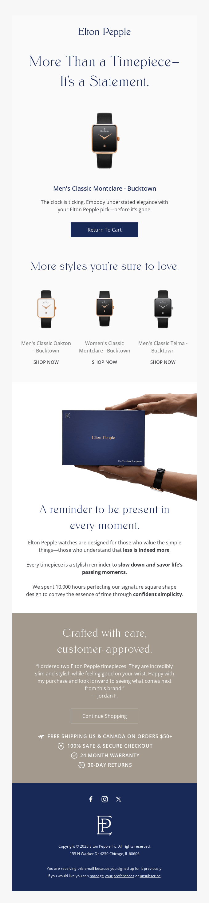
Subject line: More Than a Timepiece—It’s a Statement.
Elton Pepple turns a browse abandonment into a personal invitation to own a piece of “confident simplicity.” The whole email feels intentional — like their watches.
Why we love it:
Luxury framing without fluff. The opening line positions the product as a statement, not just a watch — perfect for aspirational shoppers.
Clear product call-back. The hero section shows exactly what the shopper viewed, plus related styles, making it easy to compare.
Trust-building close. Customer testimonial + free shipping, warranty, and return policy in one neat package remove friction at checkout.
2. OluKai
Subject line: Did you see something you liked?
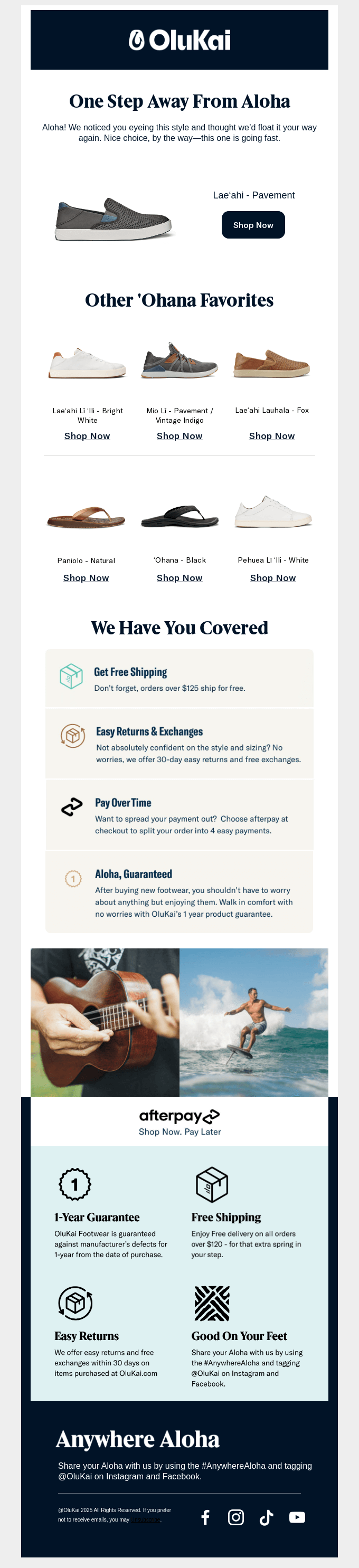
OluKai makes island-inspired footwear that’s all about comfort and craftsmanship. Their browse email feels like a breath of ocean air: calm and welcoming.
Why we love it:
The headline fits the brand perfectly. “One step away from Aloha” is warm and relaxed, just like their shoes.
Smart product selection. They show the exact product viewed, plus a few similar picks. Helpful without being overwhelming.
Solid trust section. Easy returns, free shipping, and product guarantees help hesitant shoppers feel safe hitting buy.
3. Something Navy
Subject line: Just for you
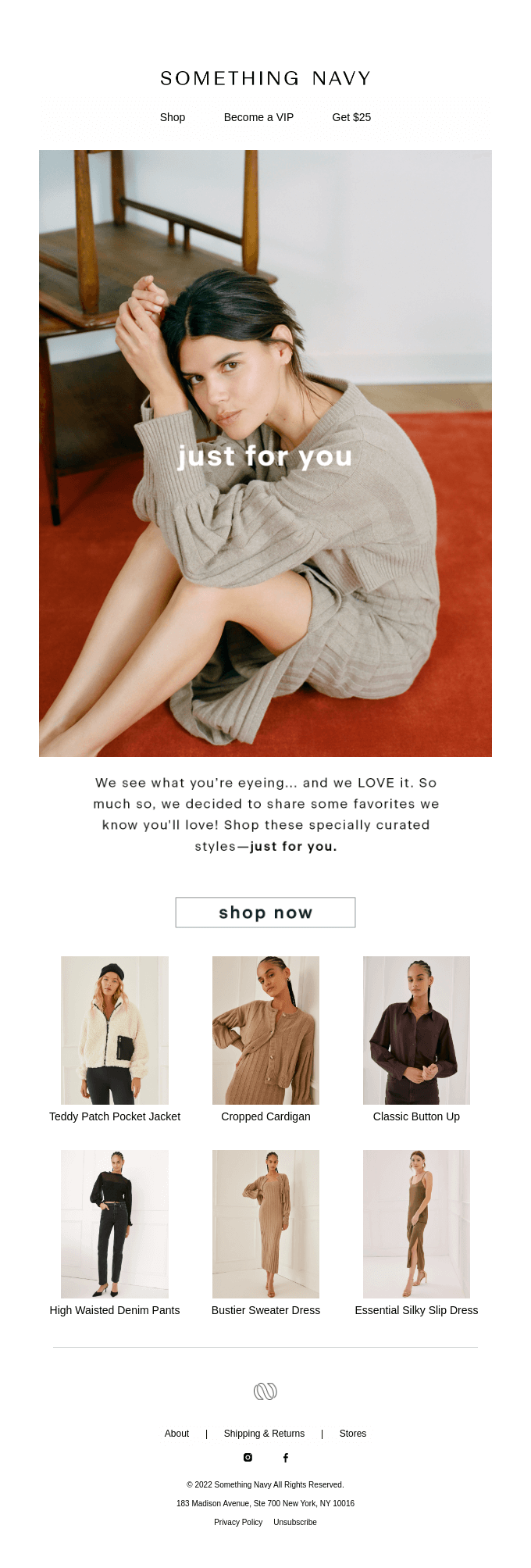
Something Navy leans into personalization with a “we’ve been watching” energy — without feeling invasive. It’s casual, curated, and aspirational.
Why we love it:
Visual intimacy. The hero image feels candid and approachable, inviting the reader into the brand’s world.
Curated grid. Product recommendations are specific and cohesive, not a random dump, which keeps decision-making easy.
Conversational tone. The copy reads like a friend sharing outfit inspo, reinforcing brand warmth and trust.
4. Hormbles Chormbles
Subject line: This could be the start of something sweet
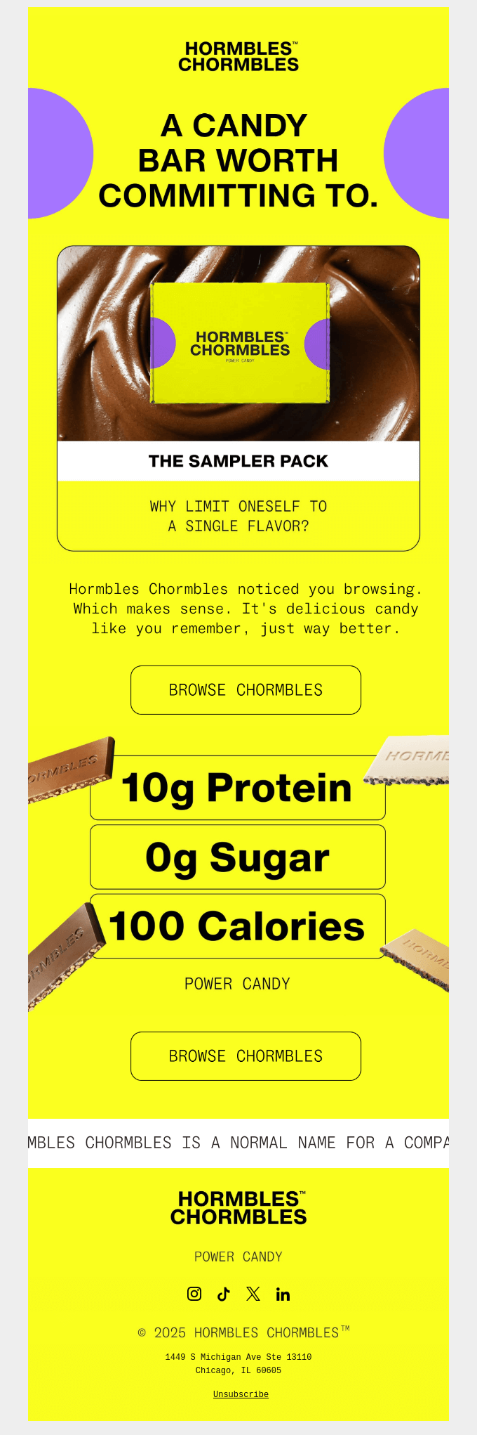
This weird-and-fun brand sells candy bars that are actually healthy. Their browse email is as loud as their personality: bright, neon colors and cheeky copy.
Why we love it:
Unapologetic headline. “A candy bar worth committing to” is bold. We love a brand that believes in itself.
They own the stalker vibe. “We noticed you browsing” is honest, not creepy. Great for transparency and aligns with their brand voice.
The sampler offer is smart. It’s perfect for indecisive shoppers who can’t make up their mind about which flavor to spend on.
5. Patagonia
Subject line: Thanks for stopping by
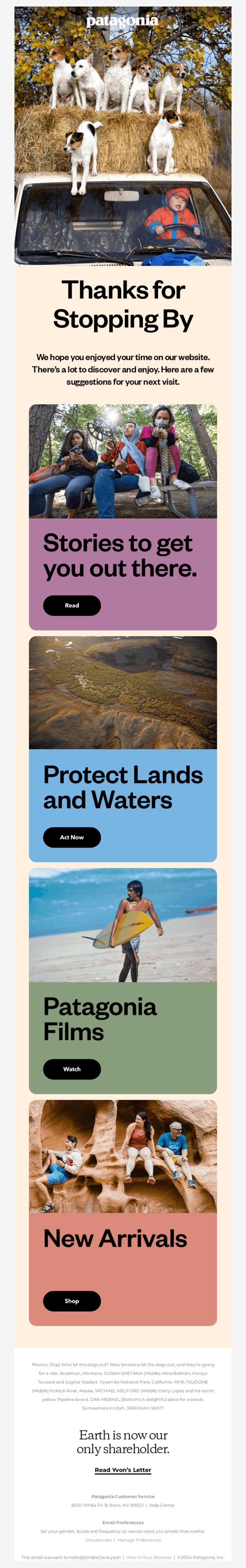
Patagonia makes its browse abandonment email about mission as much as merch. It’s a reminder of why shoppers connect with them in the first place.
Why we love it:
Cause-driven re-engagement. Instead of going straight for the sale, they invite readers to join in protecting the planet.
Multiple paths back. Whether you want to read, watch, take action, or shop — there’s a clear, visually distinct block for it.
Brand voice consistency. From playful dog imagery to their shareholder statement, every element feels unmistakably Patagonia.
4 Tips to Turn “Just Browsing…” Into “Just Bought!”
Want your browse abandonment emails to actually convert? Here’s what to keep in mind:
1. Segment your audience
Don’t blast everyone with the same email. Break your browsers into simple, high-intent segments, then tailor your messages to answer their why.
Here’s a quick cheat sheet to bookmark:
Segment | Mindset | What They Need | Messaging Examples |
First-time visitors | They’re not ready to commit yet and don’t know much about your brand. | Build trust. Highlight social proof, your brand story, and best-sellers. | “First time here? Here’s why 4,000+ shoppers love us.” “Still deciding? See what makes us different.” |
One-time buyers | Familiar with your brand, but not fully convinced to return. May need more detail. | Reinforce their last good experience and guide them toward the next purchase. Offer product education. | “Loved your first order? This pairs perfectly.” “Still browsing? Here’s what makes [Product] worth the upgrade.” |
Loyal customers | Already trust you. They’re browsing for something new or exclusive. | Recognition and VIP perks. Give early access, loyalty rewards, or insider previews. | “You’re on our shortlist – get early access to our latest drop.” “Thanks for being a loyal customer! Here’s a little something for your next order.” |
Repeat browsers | Clearly interested but hesitant. Could be overwhelmed or unsure. | Gentle push. Add urgency, comparisons, or help making a decision. | “Only 3 left in your size!” “Can’t decide? Here’s how it stacks up against our top picks.” |
2. Send a series of emails (instead of a one-time message)
One email is easy to miss. A quick, spaced-out trio feels like a conversation.
Here’s a flow that works:
Soft reminder (about 2 h later): “Still thinking about this?” with the exact product pic.
Social-proof boost (next day): Add a customer photo, star rating, or top benefit bullet.
Friendly urgency (2–3 days later): Low-stock alert, limited-time free shipping, or “Need a second look?”
Each email has one goal. No multi-CTA chaos, no inbox spam.
3. Make it personal (way beyond the first name)
Real personalization is about what they did, not just who they are. Show them you remember what they were looking at.
Include the product they viewed
Recommend 2–3 similar items
Mention something relevant (like size, color, or location)
When people feel seen, they’re more likely to tap that CTA.
4. Blend email with SMS or push (only if it helps)
If your crowd loves mobile and has opted in, a single ping can close the loop.
Example: “Still eyeing those joggers? They're almost gone! Tap here to check out 👉 [link]”
One nudge is plenty. Make sure it complements (not copies) the email, and skip it entirely if your audience isn’t into texts or push alerts.
TL;DR: Quick Wins to Bring Browsers Back
Shoppers browse for all kinds of reasons – but that click means something. A great browse abandonment email gives them a reason to come back.
✅ Get personal, but not pushy. Think bold headlines, clear product reminders, and smart segmentation tailored to where each shopper’s at.
✅ Mix personality with strategy. From Hormbles’ cheeky confidence to DSC’s no-fuss clarity, each example shows how voice + timing can bring people back.
✅ A few thoughtful touches go a long way. Series > single email, CTAs that convert, a dash of urgency, and maybe a loyalty nudge to tip the scale.
Now go and bring those browsers back!
CR San Diego: 33 Days Out. 60% Sold Out.

In just 33 days, 600+ founders, marketers, and operators will take over the San Diego waterfront for Commerce Roundtable with two days of unfiltered strategy, actionable sessions, and connections that actually move the needle.
Here’s what’s waiting for you:
🎤 Nick Shackelford keeping the energy high as MC
💡 30+ eCom experts sharing exactly what’s working in 2025
🎁 $120K in giveaways across two days
🌇 Sunset cocktails, epic afterparties, and waterfront views from morning to night
🗞️ Quick Clips:
AG1 drops three new flavors (finally): After over a decade with just one flavor, AG1 is launching three new options: Citrus, Tropical, and Berry. With over 300 prototypes tested, the goal was simple: make daily greens even easier (and tastier) to stick with.
Shopify just got an enterprise brain upgrade: Shopify merchants can now tap into Fredhopper’s AI-powered merchandising tools, natively. That means better product discovery, visual merchandising, and localization without third-party middleware. Built for scaling brands, now directly in your Shopify dashboard.
TRUBAR launches nut-free snack line for kids: TRUBAR just debuted TRUBAR Kids: a new, nut-free protein bar line designed for schools, picky eaters, and allergy-conscious parents. With up to 9g of protein and 8g of fiber per bar, they’re already on shelves at Sprouts and headed to Amazon, Walmart, and more.
Graza trades squeeze for glass: Graza’s iconic squeeze bottles have a new companion: glass bottles. Designed with a UV-blocking finish and refillable pop-up pour spout, the new packaging is all about sustainability.
Annnnd that’s a wrap for this edition!
Thanks for hanging with Chase and me. Always a pleasure to have you here.
If you found this newsletter helpful (or even just a little fun), don’t keep it to yourself! Share ecomemailmarketer.com with your favorite DTC marketer. Let’s get them on board so they don’t miss next week’s drops.
Remember: Do shit you love.
🤘 Jimmy Kim & Chase Dimond
Love this newsletter but want to receive it less frequently? Let us know by clicking here!
Reply