- eCom Email Marketer
- Posts
- Suds’ Interactive Discovery Email: A Scent-Sational Start That Could Use More Bubbles
Suds’ Interactive Discovery Email: A Scent-Sational Start That Could Use More Bubbles
Plus: Reactivation emails that work, YouTube’s AI ad update, and TikTok’s newest AI tool
Chase Dimond & Jimmy Kim
June 23, 2025
Access over 25+ hours of retention marketing modules to become a certified email & SMS marketer. Use code: SCHOOLSOUT & get certified for $200 off!

Hey it’s Chase and Jimmy here!
This week’s teardown looks at an email that almost nails it. Suds brings the energy: bold branding, a fun quiz flow, and solid personality throughout. But strong vibes alone don’t drive clicks. We break down what’s working and where it needs a cleanup to really convert.
Also inside this send:
📲 60+ plug-and-play SMS templates for every customer touchpoint
📣 Industry Intel: New ad + creator tools from Meta, Instagram, and LinkedIn
💼 Hiring Vault: 10 retention marketing jobs that are actually worth applying to
Let’s get into it.👇
📲 60+ Plug-and-play SMS templates for every customer touchpoint

Most brands treat SMS like email-lite. Shorter promos, same results.
But done right, SMS is a high-converting channel; especially when automated.
This guide from Omnisend hands you 60+ ready-to-send templates for every moment in the customer journey: welcome flows, abandoned carts, shipping updates, VIP offers, and more.
What’s inside:
Templates for 15+ use cases, from thank-yous to flash sales
Shortcuts for writing high-converting, brand-consistent texts
Performance-backed tips for tone, timing, and CTA structure
Why automated SMS drives 2x the conversions of manual sends
How to plug these into your Omnisend flows (yes, even on the free plan)
🫧 Suds’ Interactive Discovery Email: A Scent-Sational Start That Could Use More Bubbles
Suds’ email bursts into your inbox with color, confidence, and a mission: help shoppers find their perfect scent through a quiz-style journey. It’s fun, vibrant, and dripping with personality.
But does it get readers to click? Let’s scrub in!
Header Block
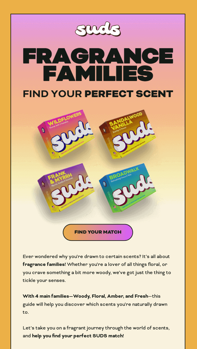
What We Love
✔ The headline does its job. “Find your perfect scent” is clear, purposeful, and sets expectations right away. You know exactly what this is about and want to keep reading.
✔ Big Suds energy. Between the bubbly logo, fun gradients, and floating soap bars, this email feels like the brand in visual form: fresh, bold, and playful.
✔ Friendly, inviting copy. The tone is spot-on. It doesn’t sound like a sales pitch. It sounds like your friend who always smells amazing and wants to help you do the same.
What We’d Do Differently
❌ Pick a better visual. While the floating soaps are colorful, you see the same thing again below. A more dynamic visual (like a lifestyle setting that evokes scent or actual suds) could pull readers in emotionally.
❌ The CTA is a little lost. “Find your Match” sounds fun, but where does it go? A website quiz? A curated shop page? Make the destination clearer. Also, move that CTA up higher so it doesn’t get lost at the bottom of the block.
❌ Too much text, too soon. Three paragraphs of copy in the header is asking a lot, especially on mobile. A quick, punchy intro would get the message across faster and lead readers straight into the good stuff.
🔍 TL;DR: Great tone and branding, but it needs a better image, a clearer CTA, and way less text up top. Get to the point faster and make it easier to click.
Body Block
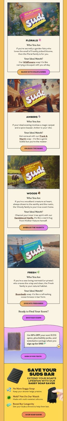
What We Love
✔ Interactive flow. Instead of just listing products, they frame each scent family like a mini personality quiz. It’s a fun, clever way to guide people toward products that fit their vibe.
✔ Blocks are full of charm (and personality!) Each soap gets its own spotlight with dreamy visuals, fun copy, and creative CTAs. We also love the product links in there for driving clicks!
✔ Bonus points for the SMS opt-in. There’s a clean little section offering 10% off to join their text list. It’s simple, well-placed, and gives the reader something extra without being pushy.
What We’d Do Differently
❌ Still no product benefits? Not a single mention of natural ingredients, plastic-free packaging, or anything else that makes these soaps special – unless you squint at the footer. That info should be right there next to the bars.
❌ It gets a little crowded. After the four scent families, we roll straight into the SMS opt-in, a soap saver promo and loyalty points. It’s a lot. Either trim some of the extra blocks, redesign the layout, or split it into a follow-up email.
❌ No social proof in sight. If someone’s new to Suds, a five-star review or a quote from a happy customer could be the nudge they need. Even a badge like “Over 10,000 bars sold!” would add credibility.
🔍 TL;DR: The scent guide is super fun and engaging, but it skips over why the products are actually worth buying. Add some benefits, drop in a review, and cut back on the extras.
Footer Block
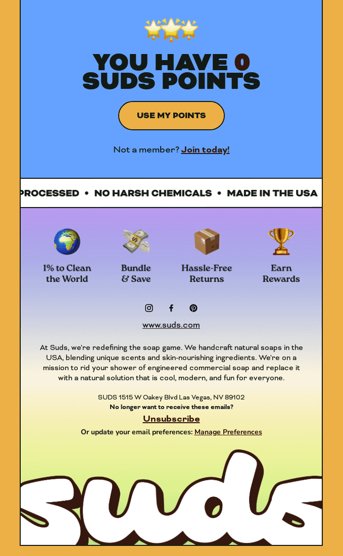
What We Love
✔ Trust-building icons. Quick call-outs like hassle-free returns or bundle and save tell shoppers what matters without needing to scroll through fine print.
✔ Preference center. Giving subscribers control over their inbox is a smart move. Always better than just offering an unsubscribe button.
✔ Strong visual finish. The big Suds logo at the end ties everything up with a nice little bow.
What We’d Do Differently
❌ Too much text. The brand story is thoughtful, but feels a bit long for the footer. Maybe replace it with a tagline or shift a shorter version up into the body.
❌ Tiny social icons. Blink and you’ll miss them. If you want people to check out your socials, make those buttons easy to spot.
❌ Missing navigation links. A footer is prime real estate for “Shop,” “About,” and “FAQs” links – especially for curious browsers who aren’t ready to buy yet but want to poke around.
🔍 TL;DR: Solid finish with trust icons and a bold logo, but it’s a bit too text-heavy. Make the social icons bigger and add a few helpful links like Shop or FAQs.
Final Thoughts: What Email Marketers Can Learn
This email is a great example of how to stay fun and on-brand without sounding salesy. The product discovery format is clever. The visuals are engaging. And the tone? Chef’s kiss.
But great vibes only get you so far. If you want people to buy, they need to know what makes your product special, why they should trust you, and what to do next.
✅ Use interactive formats. Quizzes or guided pick-your-product flows make your emails feel fun, not salesy. It gives people something to do, which keeps them engaged and clicking.
✅ Don’t bury the CTA. Stick your main button where people can actually see it: early and obvious. And be clear about what they’re clicking into so there’s no confusion.
✅ Build trust in the scroll. Drop in quick proof points like reviews and benefits along the way. You don’t need a whole pitch, just something that answers “why buy”.
Remember: fun is great, but fun + clarity + trust? That’s what sells.
📬 Inbox Index: What Real Brands Are Sending (and Why It Works)

Most swipe files show you what looks good.
This one shows you what actually works.
We broke down 12 real eCom emails, header to footer, and analyzed every detail.
What’s inside:
Real emails from real brands
What worked (and what didn’t)
Actionable tips you can steal for your own sends
If you’ve ever wondered “Is this email good enough to send?” this is for you.
👩💻 Industry Intel
From creator tools to predictive ad scores, platforms are rolling out new features designed to boost performance and polish your content. Here's what caught our eye this week:
Instagram lets creators rearrange their grid
Instagram is launching a new “Edit Grid” feature that lets users customize the layout of their profile posts; without deleting or archiving content. You can now pin your best posts to the top or curate a cleaner visual flow.
💡 Why it matters: This gives creators and brands more control over first impressions. Instead of being stuck with your latest post, you can showcase your highest-converting or most on-brand content right up front; especially useful when running campaigns or collabs.
Meta’s Edits app is turning into a full creative suite
Meta’s video editing app, Edits, just rolled out a wave of new features:
AI-powered restyling for dynamic visual effects
Transitions and granular trim/edit tools
Teleprompter and text overlay options
It’s all designed to help creators shoot, script, and share faster; without leaving the app.
💡 Why it matters: Meta is going after TikTok and CapCut with a serious upgrade. These tools give brands and influencers more creative power (and polish) while keeping content production in-platform. It also lowers the barrier for high-quality UGC and paid social.
Meta launches ‘Opportunity Score’ for ad performance
Advertisers can now access Meta’s new Opportunity Score; a rating system that predicts how well your campaign is set up to perform. It evaluates things like creative quality, placements, and audience targeting before you even launch.
💡 Why it matters: It’s like getting a diagnostic check before hitting “publish.” For lean teams especially, this could be a helpful way to catch weak spots early and prioritize higher-ROI campaigns without relying on external audits.
LinkedIn expands into video and TV ads
LinkedIn is testing “First Impressions” ads; video placements that appear the moment someone opens the app. It’s also adding Connected TV (CTV) ad support to reach professionals on their home screens.
💡 Why it matters: LinkedIn is betting big on brand-building. These placements offer prime visibility and combine the power of first-party targeting with the emotional pull of video. Expect to see more B2B brands running splashier, top-of-funnel ads here.
👨💻 The Hiring Vault
Marketing Coordinator, United States: BattlBox
Email Marketing Data Analyst, Forest Lake, MN: Bare Home
Email Marketing Manager, United States: Velvet Caviar
Manager Email Operations and Analytics, Quincy, MA: J. Jill
Associate eMarketing Manager, San Francisco, CA: Williams-Sonoma, Inc.
Email/SMS Marketing & Retention Specialist (Klaviyo), United States: New Standard Co.
Email & SMS Marketing Specialist (Contractor), United States: Sweet Water Decor, LLC
ECommerce Marketing Manager, West Hollywood, CA: SIMKHAI
Digital Marketing Mgr - Email SMS & Loyalty, Nashville, TN: Johnston & Murphy
Email & Web Designer, Culver City, CA: PAIGE
Email Marketing Coordinator, Dallas, TX: Shop Avara
That's a wrap for today!
Appreciate you hanging with Chase and me. We hope you found something you can put to work ASAP.
If you did, don’t keep it to yourself! Send ecomemailmarketer.com to your favorite DTC marketer and get them in on the action.
Catch you next time!
🤘 Jimmy Kim
Love this newsletter but want to receive it less frequently? Let us know by clicking here!
Reply